These are the Webcomics.com posts that got the most attention in 2017.
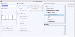
 10. Syncing Clip Studio Paint (Manga Studio) between two computers
Two of the of the strengths of Manga Studio is the ability to create page/strip templates and save image “material” to use again later.
But what if you use the software on two different computers — for example, one in your studio and another at home?
Relax. There’s an easy way to sync everything up.
FREE POST — READ IT WITHOUT A SUBSCRIPTION!
9. Six Common Mistakes Made by Webcartoonists
I’ve been writing for this site since 2009, and I see a lot of webcomics. I initiate critiques, I get asked to do portfolio reviews at conventions, and I do comic consulting. I do it because I like it. I love talking comics, and I like having the opportunity to pass along the things I’ve learned by doing this for so long. AND, as I often say — here and to my classes at Hussian School of Art — I’ve already made all the mistakes so you don’t have to.
In seeing all of those webcomics, I see a lot of the same mistakes pop up over and over again. So I want to isolate the top five — not in a “boy are you a loser” way. Rather, since many of these are so widespread, my hope is that we can take some big steps to eradicating these six.
Number one should be no big surprise…
FREE POST — READ IT WITHOUT A SUBSCRIPTION
 8. Comic Easel Shortcodes
Comic Easel has added a handy shortcode to help you place your comic into a page or blog post — and it will be already linked to that comic’s page in your archive.
Here’s a quick tutorial…
FREE POST — READ IT WITHOUT A SUBSCRIPTION
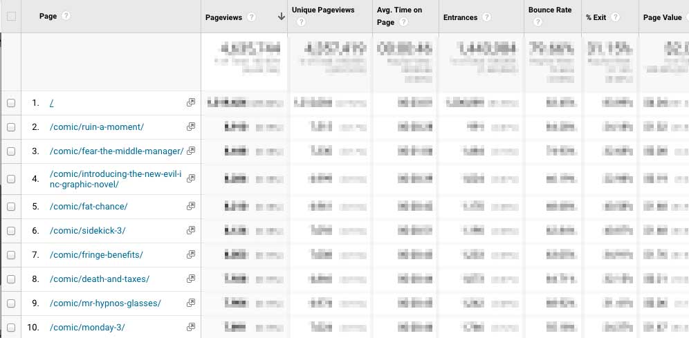
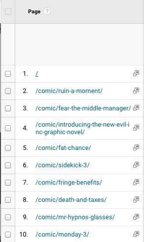
7. tpc.googlesyndication… What Does That Mean??
I was looking through my traffic statistics on Google Analytics, and I saw something odd.

Under my Referrals, the third-highest return was tpc.googlesyndication.com.
What the heck is that? And why is it sending me so much traffic?
The answer surprised me.
SUBSCRIBERS ONLY
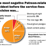
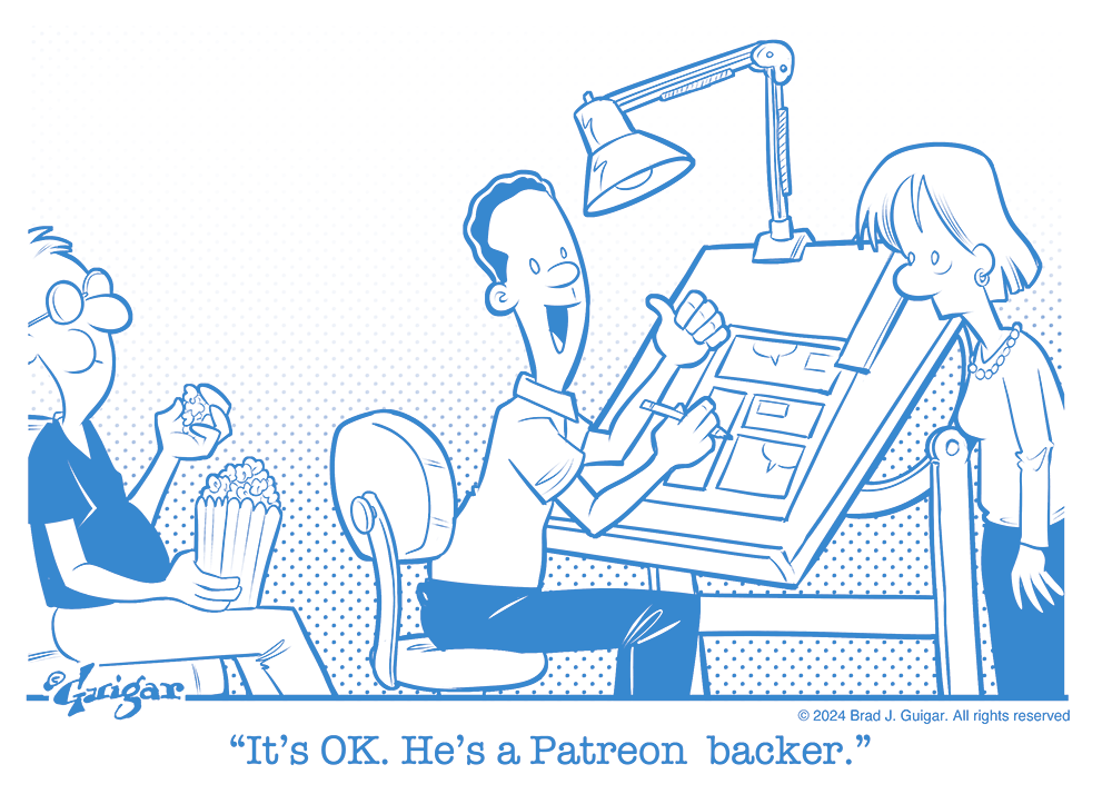
 6. Patreon greenlights Paypal for NSFW creators
Patreon’s announcement — in an e-mail to creators — that it will once again be able to offer its users to use Paypal to pledge to NSFW creators is a huge victory for the crowdfunding service. Patreon had to remove Paypal functionality for creators who were offering NSFW content after Paypal threatened to stop all payments to Patreon.
Why’d they do that? It’s not a moral issue. It’s an economic one. From the standpoint of Paypal, an adult-oriented website is problematic due to the high volume of contested charges. What’s a contested charge? Take for example someone whose spouse questions an adult-website charge on the family credit card prompting an immediate defense of “Ididn’t do that! There must be some mistake! One of the kids! Identity theft! Wandering bands of marauders!” They file a complaint with their credit-card provider which, of course, sides with its customer. The money is returned to the customer by the adult website — in a process called a “chargeback.” It causes additional transactions, processing time, and record-keeping.
SUBSCRIBERS ONLY
5. How To Use the Ames Lettering Guide
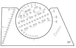
The Ames Lettering Guide is a little daunting when you begin to use it. For general use, I’m going to suggest ignoring the holes on the left-hand side of the tool as well as the metric measurements. Before we get started, let’s cover some typography terms.
FREE POST — READ IT WITHOUT A SUBSCRIPTION
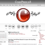
4. Customizing your site’s navigation buttons (ComicPress / Comics Easel)
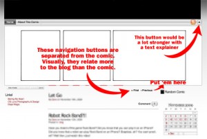
It’s no secret. I despise some of the default navigation buttons that are included with webcomic CMS packages. The ones (as seen on the right) that come with ComicsPress are especially high on this list.
Personal aesthetics aside, using the default buttons kinda makes your site look like every other webcomic. It labels you as generic. Making your navigation buttons fit the look of your Web site is the first step towards separating yourself from the pack.
FREE POST — READ IT WITHOUT A SUBSCRIPTION
3. Character Design: The Silhouette Test
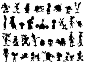
One of the most popular rules of thumb in character design is that each character should be so distinct that you can identify them solely from their silhouette.
SUBSCRIBERS ONLY
 2. Twelve Ways You’re Doing Patreon Wrong
Some cartoonists have been asking me to give them my thoughts on their Patreon pages. And I’ve opened up a new Hot Seat critique series based on members’ Patreons. And — honestly, I’m a little obsessed — when I see a new Patreon page being promoted, I go over and see how they’ve got it structured. Sometimes, I find ideas worth stealing. But more often, I’m seeing a lot of the same mistakes being made over and over again. And, in my opinion, it’s having an adverse effect on your ability to generate support.
Now, this is usually where I cut the article and throw the rest of the post behind the paywall. But this one is so damned important, I’m not going to do that. If this is you, you need to stop, rethink and rebuild.
FREE POST — READ IT WITHOUT A SUBSCRIPTION
1. Manga Studio: How To Build a Template
They say a journey of a thousand miles begins with the first step. In switching from Photoshop to Manga Studio 5 EX, that first step (for me) was building a template. It took me all weekend, and I rage-quit the darned thing three times. But once I was past that, the rest of my transition was relatively smooth.
To that end, here’s a quick-and-easy guide to creating your own Manga Studio template.
SUBSCRIBERS ONLY


 Remember… the name of the game is to get this done quick so you can get back to spending time with your family over the holidays. If you’re using ComicPress or Comic Easel, it’s gonna be a snap with shortcodes.