The ability to create Draft Layers — and apply Draft Layer settings to entire folders — is a huge part of what makes Clip Studio special. Here’s a brief tutorial to get you pointed in the right direction!
Designing a logo for your comic can be surprisingly daunting. After all, many of us are either artists or we collaborate directly with artists. But designing a logo requires a slightly different skill set than designing a comic panel. So let’s talk about some DOs and DON’Ts that apply to good logo design.
DON’T use dialogue font
The dialogue font that you’re using for your word balloons is tailor-made for that purpose. It’s not intended to be used as display type — and that’s what you’re looking for in a logo. Beginners make this mistake often — both in logos and in book-cover design. Dialogue fonts don’t work very well in these instances.
DO understand the difference between serif and sans serif typography
Serifs are those little marks that are attached to the main letterform in some fonts — like Times. They’re there to aid readability in large masses of small text. Sans serif fonts, like Helvetica, do not have these little marks. (Sans is French for “without.”)
Serif typography tends to be very formal, and a little imposing — especially when it’s used in larger sizes (like a logo). Sans serif is usually more friendly and approachable. Thinking about the emotion you want your logo to convey will help you decide which is better for you.
DON’T work in raster
Your logo needs to be flexible. It needs to be able to be reduced to the size of a postage stamp, and it needs to be able to be enlarged enough to be displayed on the side of a building — and all without a loss in quality. Thaty means you’d be wise to work in a vector-based software like Adobe Illustrator. Working in a raster-based software (like Photoshop) is going to limit your re-sizing options.
DO emphasize contrast
Legibility is key to good logo design — and, in type, that means contrast. You may want to avoid gauzy images and blurry effects. And you’ll want your color choices to reinforce the contrast. If you’re not sure, convert the image to black and white (or print it out in grayscale). You should be able to tell immediately where your logo lacks the contrast necessary to be legible.
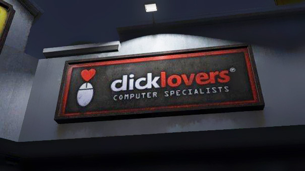
DON’T botch the kerning
Kerning is a typographic term that refers to the space between letters in a word. If you space the letters too loosely — or too tightly — you can end up with unintended results. Just ask the folks at Click Lovers…
Good kerning takes years to master. Thin letters — like lowercase l and i — tend to pull surrounding letters closer. Wide letters — like uppercase O and Q — may push surrounding letters away a little.
DO use professional fonts
Part of the joy of using a professionally-designed digital font is that an artisan who breathes typography has already programmed the kerning into the font. So don’t hesitate to purchase and use good fonts to create your logo. And if you want that hand-drawn look, take a digital font you like and trace it.
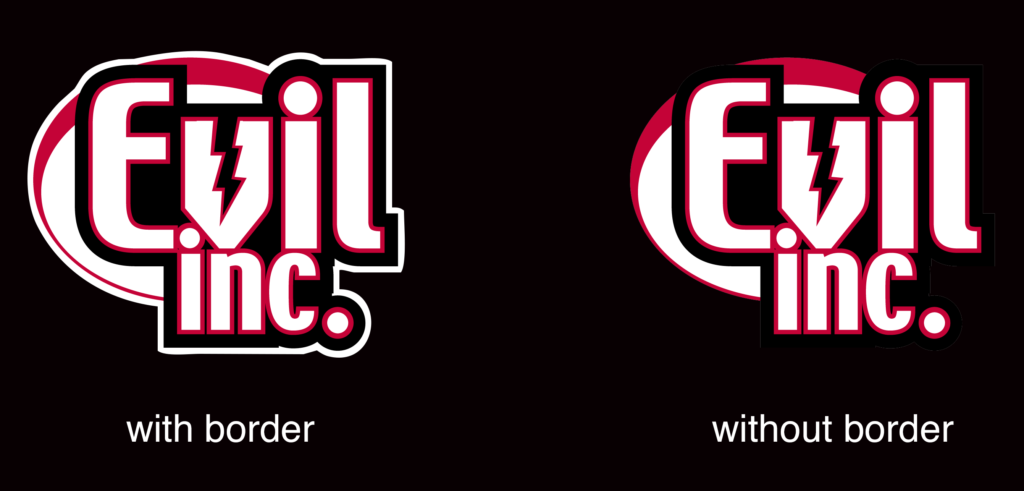
DON’T forget the border
If your logo is going to appear on top of a dark background, be sure to put a white border around it to help it from getting lost — or at the very least, prepare a version of your logo that features a white background.
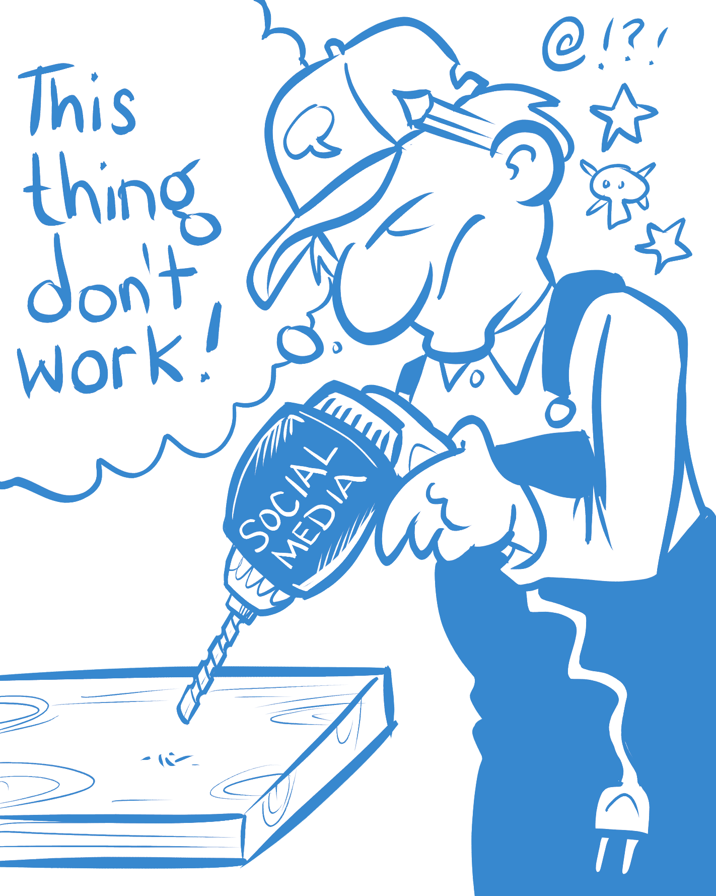
This week, exactly one week after Brad lectures on the dangers of getting distracted, one of his TikTok videos goes viral — and he spends the next two weeks… getting very, very distracted,
Questions asked and topics covered…
Going viral with a TikTok video
What does TikTok mean for comics
Pre orders vs Kickstarter
When is it right to take the leap to full-time comics?
Through the Facebook page of the National Cartoonist Society, former NCS president Bill Morrison shared his recent experience with a check scammer that many people who accept freelance commissions have encountered. Let’s talk about how it works and how to avoid it.
The content you are trying to access is only available to members.
I accept criticism on my art from two sources: peers who are on a similar journey who I reach out to for advice (like an art-school critique, for example) and people with a demonstrated proficiency in my field. You’ll notice that the list does not include comments from individual readers or people who claim to be critics on websites, podcasts, social media or video. Here’s why…
The content you are trying to access is only available to members.
While I was hosting my webinar* on webcomics for the Graphic Artists Guild, a comment came in from one of the attendees. This person said, “I think people avoid reading my comic because the archive is so big.”
I disagree. I’ll talk about why, and then discuss some strategies for creators with large archive.
If you’ve convinced yourself that readers avoid your comic because your comic is too big, I want you to consider something.
When is the last time you were reading a book and said…
“I love this book! This is a tremendous book! The characters! The plot! I’ve never enjoyed the simple act of reading so much. There’s only one thing…
“I wish there wasn’t so MUCH of it!”
You’ve never said that. No one in their right mind has ever said that. It’s nonsense. Conversely, have you ever said something like this…
“I love this book! This is a tremendous book! When I got to the last page, I go depressed because I knew it was coming to an end.”
See my point? If your comic is good — if it connects with its audience — that archive can never be large enough! If it has 4,000 comics, your audience will scream for 8,000.
But if it’s not good, your archive can never be small enough.
That’s not to say that handling a big archive doesn’t come with some challenges. So, let’s talk about some smart archive strategies.
Organization
If you’re like most of us, your archive is organized by whatever default system is in place. More than likely, it’s assembled by date. The problem is… nobody has ever said, “Y’know… I’m really in the mood to read a comic from May 2014.”
Your archive should be organized by content. If you’re doing a storyline-based comic, this is easy. The archive should be divided into those individual story arcs. And you should be identifying good places for a newcomer to jump in. You should have story synopses placed in strategic locations to facilitate these jumping-in spots.
If your comic isn’t storyline-based, you should be grouping your comics by topic. For example, a comic about cats could have the following categories…
comics about scratching posts
comics about knocking things off the table
comics about trips to the vet
comics about being finicky about food
comics about emotional aloofness
eBooks
You can take that strategy one step further and assemble those archive breakdowns into eBooks. Let’s face it. Your website offers a good reading experience, but an eBook is faster and cleaner. And, if you’re on a mobile device or a handheld tablet, an eBook is probably preferential.
Take the advice from the preceding section and build eBooks to sell on your site.
Patreon
In the early days of webcomics, a large archive was beneficial. More comics meant more web pages, and more web pages meant more ads. With a large archive (and a little savvy SEO) you could generate a significant amount of ad revenue through people just bumping into random comics on the Web.
Well, the ad market has evaporated, and people are finding their new content on social media. And your large archive is mostly an added expense (in terms of bandwidth and hosting).
So you should be using the Patreon WordPress plug-in to put a large portion of your archive behind a paywall. This is an excellent reward to offer people at the lowest ($2) tier of your Patreon — unlimited access to the archive. And it’s the only way you’re going to benefit financially from that collection of work besides eBooks and printed books.
A large archive is not a barrier to success. If your work is good, it’s a tremendous advantage. And using some very straightforward, common-sense thinking you can use that advantage to its full potential.
I’m a firm believer in basing a Patreon campaign on exclusive content, and then over-delivering. I try to post for my backers as often as possible — and as early as possible. Here’s a great way to do just that.
At the beginning of the month, I like to throw as many posts at my Patreon backers as I can. This is a great way to welcome new members and remind older backers why they enjoy participating in my Patreon. Remember, some of these folks may have forgotten they had subscribed, and now they’re evaluating whether to continue now that they see the withdrawal from their account!
A quick and easy way for me to do this is to offer them an impressive array of rewards at the beginning of the month. This includes…
Desktop backgrounds (with the new month’s calendar)
Backgrounds for mobile devices
Printable calendars
I choose a piece of art from the previous month’s offerings for the image. This might be a commission, a single-panel cartoon, or an attractive panel from a comic.
I’ve gathered some screen sizes and aspect ratios from popular mobile devices and desktop monitors. I include a printable version at letter size as well as A4 for my European backers. And backers are always welcome to suggest a new size.
There are about 30 different sizes. The entire thing takes about forty-five minutes to complete.
Plus — BONUS — since they’re based on popular monitor ratios, four of these will work perfectly as Zoom backgrounds for many of your backers.
This really depends on your laptop and the webcam it uses. Most built-in webcams in modern laptops are either 720p or 1080p, which means they have a 16:9 aspect ratio. 16:9 images include those of 1280 x 720 pixels and 1920 x 1080 pixels. Some webcams have (or can be set to) a 4:3 aspect ratio, which includes images of 1024 x 768 pixels and 1280 x 1024 pixels.