• Home
  • Contact
  • FAQs
    • What is Webcomics.com?
    • Member Benefits
    • How To Post an Article or News Item
    • How to Post a Webcomic on the List
    • How to Post a Comic
    • Terms of Service
  • Forums
  • WebComics List
  • Benefits
    • Print Vendors: Get multiple quotes
    • Banner stand: Discount
    • Consultation discount
    • “How To Make Webcomics” book: discount
    • “Webcomics Handbook”: discount
    • ALL benefits
  • My Account
    • Welcome
    • What is Webcomics.com?
    • My Subscription
    • Join us!
  • Account
  • Membership List
Twitter Email RSS

Webcomics.com

How To Make WebComics

Webcomics Handbook

‹ ComicLab Ep 181 — Brad Guigar is a TikTok star Draft Layers in Clip Studio ›

Designing a logo — Do’s and Don’t’s

Designing a logo for your comic can be surprisingly daunting. After all, many of us are either artists or we collaborate directly with artists. But designing a logo requires a slightly different skill set than designing a comic panel. So let’s talk about some DOs and DON’Ts that apply to good logo design.

DON’T use dialogue font

The dialogue font that you’re using for your word balloons is tailor-made for that purpose. It’s not intended to be used as display type — and that’s what you’re looking for in a logo. Beginners make this mistake often — both in logos and in book-cover design. Dialogue fonts don’t work very well in these instances.

DO understand the difference between serif and sans serif typography

Serifs are those little marks that are attached to the main letterform in some fonts — like Times. They’re there to aid readability in large masses of small text. Sans serif fonts, like Helvetica, do not have these little marks. (Sans is French for “without.”)

Serif typography tends to be very formal, and a little imposing — especially when it’s used in larger sizes (like a logo). Sans serif is usually more friendly and approachable. Thinking about the emotion you want your logo to convey will help you decide which is better for you.

DON’T work in raster

Your logo needs to be flexible. It needs to be able to be reduced to the size of a postage stamp, and it needs to be able to be enlarged enough to be displayed on the side of a building — and all without a loss in quality. Thaty means you’d be wise to work in a vector-based software like Adobe Illustrator. Working in a raster-based software (like Photoshop) is going to limit your re-sizing options.

DO emphasize contrast

Legibility is key to good logo design — and, in type, that means contrast. You may want to avoid gauzy images and blurry effects. And you’ll want your color choices to reinforce the contrast. If you’re not sure, convert the image to black and white (or print it out in grayscale). You should be able to tell immediately where your logo lacks the contrast necessary to be legible.

DON’T botch the kerning

Kerning is a typographic term that refers to the space between letters in a word. If you space the letters too loosely — or too tightly — you can end up with unintended results. Just ask the folks at Click Lovers…

Via BadPanda.com — 37 Bad Letter Spacing Examples That Made All The Difference

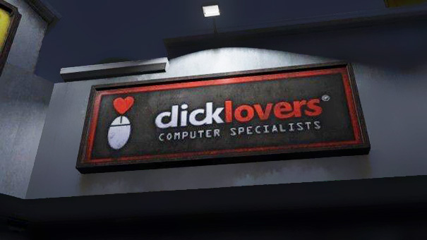
Good kerning takes years to master. Thin letters — like lowercase l and i — tend to pull surrounding letters closer. Wide letters — like uppercase O and Q — may push surrounding letters away a little.

DO use professional fonts

Part of the joy of using a professionally-designed digital font is that an artisan who breathes typography has already programmed the kerning into the font. So don’t hesitate to purchase and use good fonts to create your logo. And if you want that hand-drawn look, take a digital font you like and trace it.

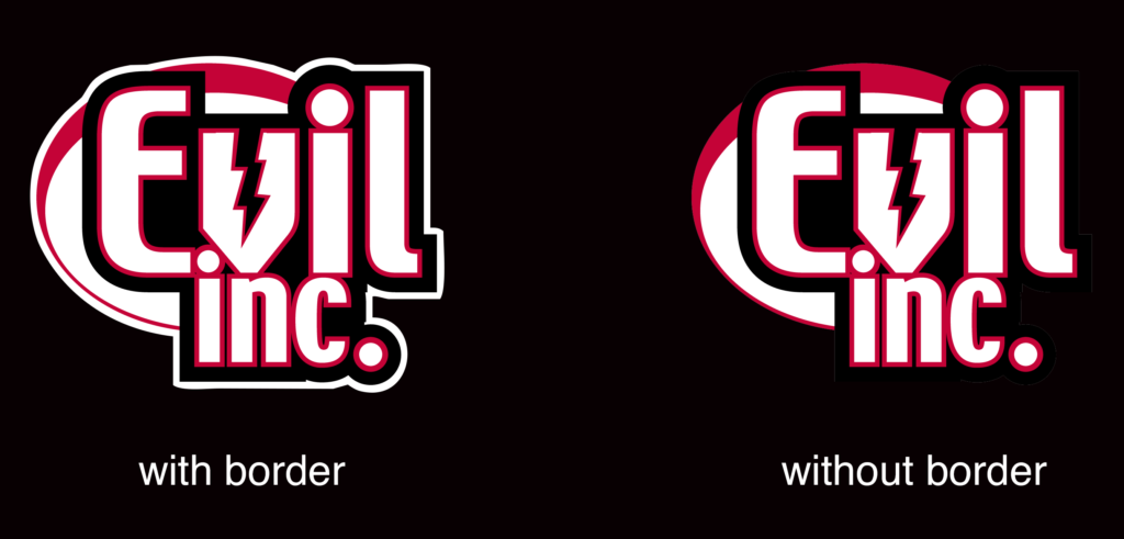
DON’T forget the border

If your logo is going to appear on top of a dark background, be sure to put a white border around it to help it from getting lost — or at the very least, prepare a version of your logo that features a white background.

For more information

ComicLab Ep 126 — Supportive Life Partners
Logo Hot Seat, Part One: Legibility
Logo Hot Seat, Part Two: Negative Space
Logo Hot Seat, Part Three: Typography
Logo Hot Seat Part Four: Concept
Logo Hot Seat, Part Five: Concept

Share this:

  • Facebook
  • Twitter
by Brad Guigar on June 11, 2021
Posted In: Art, Business
Comments available to logged in users only.


Recent comments

  • hpkomic on Managing commissions
  • Brad Guigar on Tweet and sour
  • Kulanah on Tweet and sour
  • Kulanah on Tweet and sour
  • Andrew Fraser on Tweet and sour

Search


Webcomics.com Poll

I design my comic specifically for smartphones and digital tablets.

  • Disagree (52%, 178 Votes)
  • Agree (48%, 166 Votes)

Total Voters: 344

Loading ... Loading ...
  • Polls Archive

Categories

  • Archive Dive
  • Articles
    • Advertising
    • Art
    • Business
    • Community
    • Conventions
    • Creativity
    • Crowdfunding
    • Digital publishing
    • Image prep
    • Lettering
    • Marketing / Social Media
    • Merchandise
    • Print publishing
    • Tech
    • Web site
      • Web Site Design
    • Writing
  • ComicLab
  • Edited and Ready
  • Events
  • Guest
  • Hot Seat critiques
  • Information
  • Interviews
  • Livestream Chat
  • Mail Bag
  • Member Benefits
  • Promos
  • Site News
  • Surviving Creativity
  • To-Do List
  • Uncategorized
  • Video
  • Webcomics Confidential
  • Webcomics Weekly
  • Webcomics.com Poll

Tags

ad revenue AdSense advertising Comic Easel comments composition contract copyright creativity exercise credit cards Crowdfunding digital lettering digital publishing Facebook holiday Humor IP KDP Kickstarter Kindle legal lettering line weight Longform comics Manga Studio merchandise NCS panels Patreon Promotion PulsePoint readers revenue SEO shipping social media Square taxes trademark Twitter typography Web design word balloons WordPress writing

Special Features

Just now, in the forum…

  • Navigation advice
  • Mixing First and Third Person Captions
  • Help with Toocheke
  • Label Printer for shipping
  • Patreon Merch

Recent Posts

  • April Fool’s Day
  • ComicLab Ep 276 — Special guest Lar deSouza
  • Writing a memorable character
  • Should you create your own font?
  • Writing ‘beat to beat’

Recent Replies

  • Brad Guigar on Navigation advice
  • Brad Guigar on Mixing First and Third Person Captions
  • Brad Guigar on Help with Toocheke
  • Brad Guigar on Label Printer for shipping
  • Andrew Fraser on Label Printer for shipping

Recent Topics

  • Navigation advice by KevinWayneW
  • Mixing First and Third Person Captions by jpactor
  • Help with Toocheke by Andrew Fraser
  • Label Printer for shipping by Andrew Fraser
  • Patreon Merch by Jaycee Knight

Recent Comments

  • hpkomic on Managing commissions
  • Brad Guigar on Tweet and sour
  • Kulanah on Tweet and sour
  • Kulanah on Tweet and sour
  • Andrew Fraser on Tweet and sour
  • My Subscription
  • Store
  • Terms of Service
  • Account
  • Membership List

©2007-2023 Webcomics.com | Powered by WordPress with ComicPress | Subscribe: RSS | Back to Top ↑