They say a journey of a thousand miles begins with the first step. In switching from Photoshop to Manga Studio 5 EX, that first step (for me) was building a template. It took me all weekend, and I rage-quit the darned thing three times. But once I was past that, the rest of my transition was relatively smooth.
To that end, here’s a quick-and-easy guide to creating your own Manga Studio template.
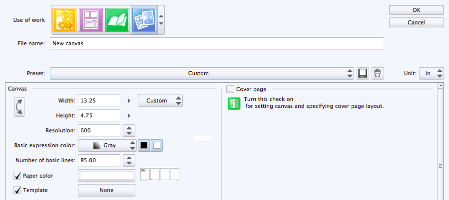
You’re going to start with the document settings that you expect to work in regularly.
Width and Height. The physical size should be large enough to accommodate any printing plans you have. (For me, that’s big enough to fit a 13×4-inch strip with a little margin all around.)
Resolution. Be sure to make this hi-res (600 dpi or higher).
Basic Expression Color. Take note! Since I’m only doing pencils and inks at this stage, I have this set to Gray (as opposed to Color). That’s going to limit the load I’m placing on my processor. Manga Studio isn’t going to gear itself up to accommodate thousands of colors — merely variations of black and white (note, both the black and the white boxes are selected to the right of basic Expression Color). However, you’re still going to be able to use color — for example, if you like to pencil in blue. Stay tuned.
Add your template elements
For my daily strip, I like to have certain elements built into my template. These are things that will appear in almost every strip. These are also layer elements that will play a part in my workflow every time. Adding them to a template saves me a lot of time. These elements include:
- Copyright notation
- Signature image
- URL/e-mail
- Frames (ie: panels)
- A sketch layer
- A word balloon with some sample text set to the text style of my comic.
Since I worked for years in Photoshop, I had a similar template already built. And you can easily import Photoshop files into Manga Studio. That’s what I did. My Photoshop template was the template for my Manga Studio template.
Operation tool
This was not intuitive to me, so I’ll just make a quick note here. To move something around your canvas, you must use the Opertion tool. It’s the second from the top on the toolbar, and looks like an arrow pointing to a 3-D cube (for some inexplicable reason).
If you try to use the tool that looks like the cursor you’re used to using in Adobe products (the black arrow two places down from the Operations tool), you’ll move the entire layer!
 Copyright, URL and e-mail
These should definitely be a part of your comic’s template. At the very least, they’re something to try to send traffic to your site if/when your comic gets swiped and or re-purposed.
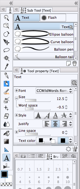
This is as easy as clicking the Text tool, and creating lines of type.
It’s at the bottom of the tool bar, second from the bottom. But it’s grouped with the word-balloon tools. So, if you don’t see a capital “T” — but a word balloon or balloon tail, instead — just click the word-balloon element and then switch to Text in the Sub Tool menu (that’s the top of the column to to the right of the toolbar).
Fair warning for PS converts: Manga Studio doesn’t “do” text boxes. You’ll click the Text tool on the canvas where you want the text to appear and start typing.
Use the Tool Property menu to adjust the font, size, word space (kerning), line space (leading), justification and more.
Frames
Next up, since my comic is usually a four-panel comic, I’ll create a four equal frames. (Don’t worry, these frames are very flexible, you’re not locking yourself into anything.)
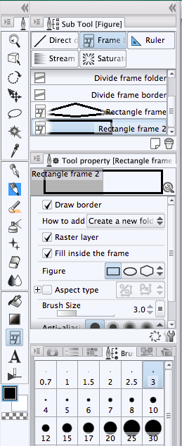
First, I click my Frame tool. It’s directly above the Text tool, but it’s grouped with the Ruler tools, and a couple specialty line tools. So, again, if you don’t see the Frames icon in the toolbar, click on the Ruler icon (or the Lines icon) and then switch to Frames in the Sub Tool menu.
Inside that Sub Tool menu, select Rectangle Frame, and in the Tool Property underneath, be sure the rectangle is selected. You can tweak the weight of the line by increasing or decreasing the Brush Size. The lines of the frames in the example to the right are 3 points (pretty thin). I would probably adjust those to be about 12-24 points.
Do not try to draw four equal frames. This way is far easier. Click and drag a rectangular frame across the entire area of your strip (or page).
Now you’re going to see a purple area around your frame (and when you zoom in, you’re going to see that the purple area intersects with your frame line.
Don’t panic.
That purple area is the mask that will keep all of the lines you draw inside the frame (unless you set it up to do otherwise). This mask is behind the line of the frame.
When I first saw that, I assumed it was in front of the 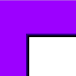 line of the frame. And, if that was the case, was I going to have to make my frames 24 point if I actually wanted a 12-point line? Don’t make the same mistake. What that purple area is telling you is that when you draw a line that goes to the edge, it’s going to let that line go about halfway into the line before cutting it off. In other words, it’s going to “trap” the line. If it cut your drawn line off right at the border, you might end up with a thin line of white along the inside border of the frame. Get it?
Before we can make that into four equal panels, we have to set a gutter size. Go to Manga Studio -> Preferences and click Layer/Frame.
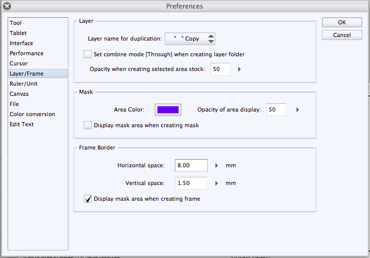
In this case, we’re going to set the Horizontal space to a gutter size we’re comfortable with. In the example above, it’s 8 mm. (Unfortunately, your only choices for units here are millimeters and pixels).
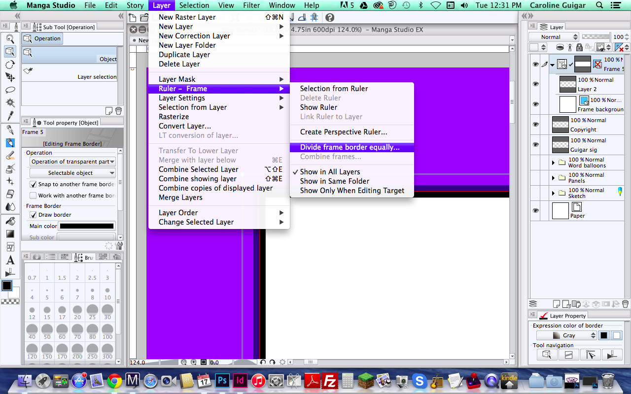
Now, go to Layer -> Ruler – Frame -> Divide Frame Equally.
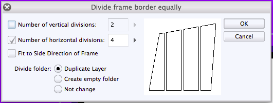 You’ll get a dialog that looks like one on the right.
Note, I’m only making horizontal divisions (the vertical divisions box is not checked).
I’m dividing that large initial frame into four frames. And — in clicking the Duplicate Layer radio button — I’m creating a new Layer for each of the four frames.
If I were building a template for a graphic-novel page, I could easily create a grid by activating the Vertical Divisions and adjusting the number.
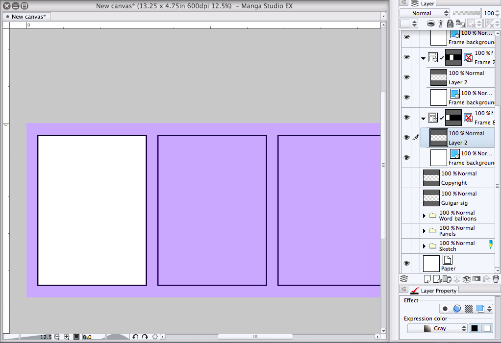
Using the Frames Layers
Now I have a four frames for my comic strip. And each of the frames has its own Layer.
When I’m drawing the illustration for the first frame, for example, I’ll click on the corresponding layer (you can see it highlighted in the Layers palette below) and draw my heart out.
Word balloons
I like to have a word balloon on my template, too. It has a block of text — set to my text specifications — and a word balloon. I have merged these two layers so they act as one, single layer, but the two units — the text and the balloon itself — are still separate entities that I can manipulate individually. And this is where Manga Studio’s handling of text is going to make you a believer. I can…
MOVE BALLOON AND THE TEXT AS A UNIT
If I select the balloon with the Operations tool and then click on the large rectangle that appears outside of the balloon, I can move both the text and the balloon as a unit.
SELECT THE TEXT AND MOVE IT INDEPENDENTLY
If I select the balloon with the Operations tool and then click on the text, a rectangle appears around the text. If I click this rectangle, I can move the text — but the balloon stays put.
SELECT THE BALLOON AND MOVE IT INDEPENDENTLY
If I click right on the line of the balloon with the Operations tool, I will see the balloon itself selected with dozens of little bezier handles. If I adjust that large rectangle around the balloon now, it’s only the balloon that moves.
AND BEST OF ALL…
I don’t have to pre-select the balloon layer! No matter which layer I’m working in, I can adjust a word balloon by clicking on it with my Operations tool.
Note: I keep my word balloons on a folder of layers above the folder of Frame layers. That’s because, in my strip, word balloons usually float in front of the frame lines. However, when I want a balloon to appear cropped inside a frame border, I simply click that balloon’s layer and drag the layer inside the Frame folder that it is supposed to appear in. But we’re going to talk more about folders of layers in an upcoming post.
Sketch layer
Finally, I set up a Sketch layer. This is the layer that I’ll do my pencilling in.
I create a new layer, and then in the Layers Palette, I go to Layers Settings -> Set as Draft Layer.
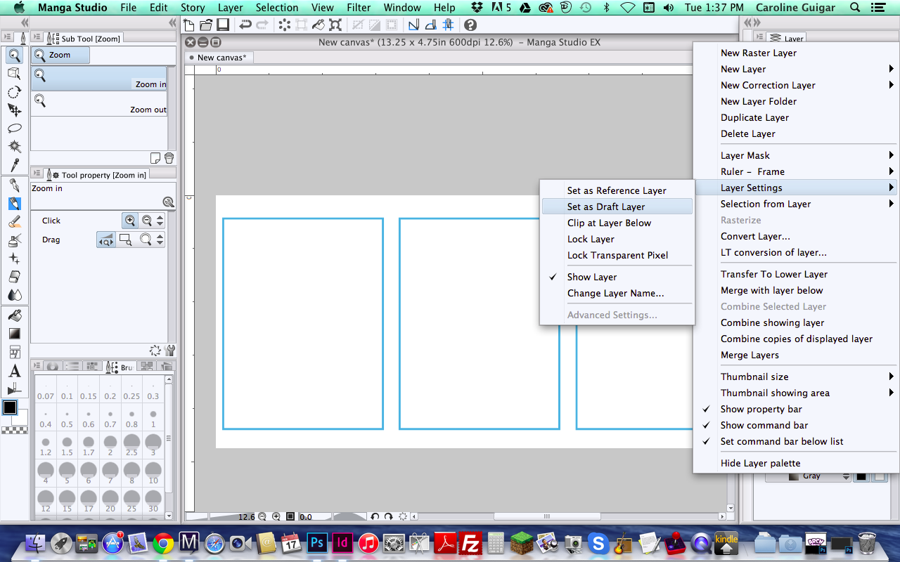
And if you like pencilling in blue, you can do that despite the fact that you’ve set this file up in “gray” mode. Go to the Layer Property sub menu at the bottom of the Layers palette. It looks like this:
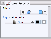
Click the Layer Color icon (at the top, right-hand corner, it’s the two overlapping squares). When you click on it, you’ll get a Layer color dialog. The palette now looks like this:
And now, anything you draw in this layer will be blue!
Don’t like blue? Click that arrow to the right of the blue bar, and you’ll be able to make it whichever color you’d prefer.
Why is that so cool? Because Draft Layers never appear in the final output. They don’t export (if you convert them to Photoshop files for coloring, for example). They only appear for you!
And since everything you draw in this layer is blue, you never again have to worry about inking in your sketch layer!
Creating the template
Whew. That was a lot of work. Luckily, you’re never going to have to do it again (until you want to tweak your template, of course).
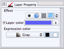
Once you have everything positioned just the way you want it, go to Edit -> Register Layer as Template Material.
Technically, I’d like to see that adjusted to “Layers” because it’s going to include all of the layers.
Give your template a name (under Material name). And be sure to store it in the Framing templates folder (in that section on the far right). And hit save.
You’re not done yet
Next, open a new document. It should have saved the width, height and resolution that you input in the first step, but double-check just to make sure. But don’t hit OK yet.
Under Canvas, click Template. Scroll down. If you’ve done everything correctly, you should see you personalized template at the bottom of the list. Select it.
And now, to the far right of the Preset section, click on that icon that looks like an old-fashioned floppy disc.
Give your Preset a name.
You’ve officially created your Manga Studio template! The next time you start a new comic, launch Manga Studio and make sure your Preset is selected (it should be the new default). Once you hit OK, you’ve got everything just the way you want it — from the canvas size and resolution, right down to your frames, word balloon style, and sketch layer.