The crossbar ‘I’
You don’t need a subscription to read today’s post!
This is a re-post from the Webcomics.com archive. If you’ve ever been curious about the kind of information, tutorials and advice that you’ll get as part of your subscription to Webcomics.com — EVERY DAY — then this is a good example.
If you’d like to join the site, you can get a 12-month subscription for $30 — or you can get a one-month Trial for $5 … with no obligation after your 30 days expire. For less than three bucks a month, you can get a steady flow of information, tutorials and advice targeted towards your webcomic business — plus a private forum to discuss issues with other professionally minded cartoonists.
I had an epiphany today. (I know… two days too late, right?)
Teaching the lettering segment of my Sequential Arts class at Hussian College, I covered some of the basics of lettering — both hand-lettering and digital lettering.
During the course of the lecture, I described how letters have “push” and “pull” that affects their kerning. Letters that trap a lot of white space (O, Q, D, for example) push other letters away a little bit. And letters that are skinny (I, J, T and L, for example) tend to pull their neighbors in a little.
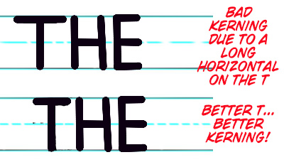
I pushed further by saying that the main mistake novice letterers make with letters such as T, J and L is that they make the horizontal aspects of those letters too wide.
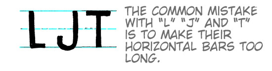
See, when you make the horizontal line on a capital T too wide, it’s impossible to get the other letters close enough to kern it correctly.
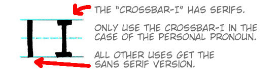
And, after that I discussed the “crossbar-I rule.”
In comics, the crossbar-I rule asserts that the crossbar I (that, is, the capital letter I, drawn with serifs) should only be used for the personal pronoun* “I.” In all other instances, the sans serif capital “I” should be used.
Now, this is a rule of thumb that has gotten a little debate on this site over the years. And, I’ll be honest with you. I’ve never been able to put into words an adequate response to people who challenge this rule. I mean, I know that I prefer the way it looks. Subjectively, I can tell you that much. And secondly, when people like Chris Eliopoulos and Nate Piekos suggest the crossbar-I rule, I respect their proficiency so much that I tend not to question it.
But that’s not an answer to: “Why?”
I mean, you could argue that the personal pronoun “I” is the only time that a capital I could be mistaken for a number 1 or a lowercase L (l). And, therefore, it’s the only time you need the serifs as a distinction.
And that’s a darned good argument. But it’s not an answer to “why.”
So… back to Hussian College.
As I’m describing the crossbar-I rule, one of my students says, “So… you’re saying to only use the crossbar I when it stands alone?”
And, well… like I said… epiphany. The “why” suddenly struck me.
Go back to the discussion of the letters T, J and L — and how drawing the horizontal parts of those letters make it too difficult to kern them correctly.
That’s the “why” — from a typographer’s standpoint… because drawing the serifs on the letter I makes it too difficult to correctly kern a word containing “I.” The letter “I” gets kerned very closely. It’s one of those letters that pulls its neighbors in — only it’s harder to get as close as you need to get with those pesky crossbars getting in the way!
And words like “I’m” and “I’ll” — that technically take a crossbar-I? Well, that apostrophe creates a flexible area inside which you can adjust the kerning properly. In other words, the apostrophe doesn’t take up a lot of room, but it’s more than enough to compensate.
The crossbar I stands alone. Because it must.
Mind blown? Well, maybe not. But it has a beauty that I’d never fully realized before. Perhaps you’ll feel the same way.
*A personal pronoun takes the place of a noun. In this case, a personal pronoun “I” would be used as such: “I go to the lake.” Also: “Jim and I are pals.”


Recent comments