Are you obligated to accept criticism from… anyone?? Also, we’ll discuss Kickstarter’s new Add-on feature and the benefits of both digital and traditional coloring techniques.
Patreon’s Image Gallery offers the ability to post multiple images. It’s got tremendous potential, but most comics artists are under-using it.
Optimize the comics-reading experience for mobile users
Certainly, this new feature will be good for posting several different images for backers. But it has a second use that is far more practical — especially as the consumption of content veers increasingly towards mobile screens. You can now post your comic in a panel-by-panel format that improves the reading experience on small screens.
If you’re following the Multi-Channel Publishing strategy shared here previously, you’re already prepping your comic in this format for sharing on sites like Instagram and Webtoons. (If not, you now have an additional reason to consider it.
Using these individual panels to post your comic to Patreon backers would give those backers using mobile devises a vastly improved reading experience. Truthfully, you could easily have the best of both worlds. The primary image could be the full, multi-panel comic. This would satisfy overall display aesthetics and the concerns of desktop users. The subsequent images would then be that same comic, divided into a panel-by-panel display.
Better still, you can bulk-upload several images at once with a simple drag-and-drop function. And you can change the sequence of display by dragging an image into its proper position. So, for example, if your panels uploaded as A-C-B, you can click on “C” and drag it into its proper placement after “B.”
Here’s a look at the results, from the screen of my iPhone…
If you’re not sure how many of your Patreon backers are using mobile devices to access your content, this is a great excuse to do a Patreon poll and ask them!
I’ve been teaching at the university level since 2014, and I’ve noticed something alarming. We’ve been giving young people the wrong idea about education. Worse yet — it’s something I’d been doing with my own children!
The content you are trying to access is only available to members.
It’s difficult for many of us to promote our creative efforts effectively because it feels like bragging. After all, how are ew suppose to extoll the virtues of our own work without sounding conceited? I have a strategy for you that works every time — and makes your outreach a lot less ham-handed. Instead of talking about how great your comic is, talk about your “Pride & Joy” instead.
The content you are trying to access is only available to members.
If there was ever a pivotal year in webcomics, it was 2014. Ad-blockers, social media, crowdfunding, and so much more happened in exactly the right order to deliver independent cartoonists to the best self-publishing conditions we’ve ever experienced.
Impostor Syndrome — what is it, and how can we, as creative professionals, battle against it?
In 2018, an art teacher wrote in to ask why it was that they could never seem to finish a comic. Brad’s response was “Maybe you’re not a cartoonist, and maybe that’s OK.” This week, the art teacher writes back with an update — and it’s a doozy!
The ability to create Draft Layers — and apply Draft Layer settings to entire folders — is a huge part of what makes Clip Studio special. Here’s a brief tutorial to get you pointed in the right direction!
Designing a logo for your comic can be surprisingly daunting. After all, many of us are either artists or we collaborate directly with artists. But designing a logo requires a slightly different skill set than designing a comic panel. So let’s talk about some DOs and DON’Ts that apply to good logo design.
DON’T use dialogue font
The dialogue font that you’re using for your word balloons is tailor-made for that purpose. It’s not intended to be used as display type — and that’s what you’re looking for in a logo. Beginners make this mistake often — both in logos and in book-cover design. Dialogue fonts don’t work very well in these instances.
DO understand the difference between serif and sans serif typography
Serifs are those little marks that are attached to the main letterform in some fonts — like Times. They’re there to aid readability in large masses of small text. Sans serif fonts, like Helvetica, do not have these little marks. (Sans is French for “without.”)
Serif typography tends to be very formal, and a little imposing — especially when it’s used in larger sizes (like a logo). Sans serif is usually more friendly and approachable. Thinking about the emotion you want your logo to convey will help you decide which is better for you.
DON’T work in raster
Your logo needs to be flexible. It needs to be able to be reduced to the size of a postage stamp, and it needs to be able to be enlarged enough to be displayed on the side of a building — and all without a loss in quality. Thaty means you’d be wise to work in a vector-based software like Adobe Illustrator. Working in a raster-based software (like Photoshop) is going to limit your re-sizing options.
DO emphasize contrast
Legibility is key to good logo design — and, in type, that means contrast. You may want to avoid gauzy images and blurry effects. And you’ll want your color choices to reinforce the contrast. If you’re not sure, convert the image to black and white (or print it out in grayscale). You should be able to tell immediately where your logo lacks the contrast necessary to be legible.
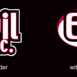
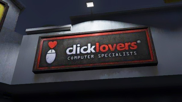
DON’T botch the kerning
Kerning is a typographic term that refers to the space between letters in a word. If you space the letters too loosely — or too tightly — you can end up with unintended results. Just ask the folks at Click Lovers…
Good kerning takes years to master. Thin letters — like lowercase l and i — tend to pull surrounding letters closer. Wide letters — like uppercase O and Q — may push surrounding letters away a little.
DO use professional fonts
Part of the joy of using a professionally-designed digital font is that an artisan who breathes typography has already programmed the kerning into the font. So don’t hesitate to purchase and use good fonts to create your logo. And if you want that hand-drawn look, take a digital font you like and trace it.
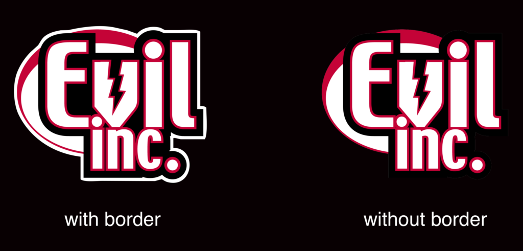
DON’T forget the border
If your logo is going to appear on top of a dark background, be sure to put a white border around it to help it from getting lost — or at the very least, prepare a version of your logo that features a white background.