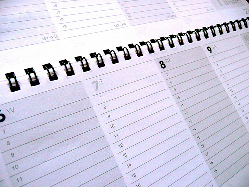
Mary Cagle’s drawing coloring tutorials
Mary Cagle posted this in the Private Forum, but I wanted to make sure to showcase it out here in case anyone missed it:
The content you are trying to access is only available to members.
Mary Cagle posted this in the Private Forum, but I wanted to make sure to showcase it out here in case anyone missed it:
The content you are trying to access is only available to members.
From Mashable, here are five Gmail productivity tips that I found really useful.
The content you are trying to access is only available to members.
[NOTE: This is an archive post. A “new post” e-mail was sent out by mistake.]
I’m afraid I’m going to have to ask the members who are participating in the Reddit thread to discontinue.
In discussing logos, we’ve hit legibility, negative space and typography. In the preceding installment, we began talking about concept. In this final installment, we’re going to conclude the concept discussion.
The content you are trying to access is only available to members.
In discussing logos, we’ve hit legibility, negative space and typography.
The fourth key to good logo design is concept.
In other words, this is the idea behind the logo itself. Making the image (if any) work together with the type to convey something significant about the comic. It’s the hook, if you will — the spirit of the logo.
There are a lot of logos that could be improved by addressing their approach to concept. So many that I’m going to break this section into two parts.
The content you are trying to access is only available to members.
When Scott Kurtz intriduced comics writer Mark Waid for his keynote address at the 2010 Harvey Awards ceremony, he referenced the phenomenon of “Mark Waid is evil” T-shirts, joking that he wanted to walk up to one of these guys with a shirt that said, “No shit.”
The content you are trying to access is only available to members.
As we head into the four quarter of 2010, I thought it might be a good time to go over some information that’s going to come in handy by the end of the year. Keeping good records is going to do two things. First, it’s going to help you calculate your taxes accurately and avoid any mistakes that might get you flagged for review. Secondly, in the event that you are called in for an audit, having your records in order will help you navigate the process in a much better frame of mind. All of the following links take you off-site to the IRS’s official advice on each topic.
The content you are trying to access is only available to members.
In the first Logo Hot Seat, we discussed some flaws that fall under the heading of an important element of design: Legibility. In the next Hot Seat, we talked about using Negative Space to improve your logo.
In this next group of logos, I’d like to discuss another important aspect of design: Typography.
Typography is such a powerful tool. It can convey attitude and emotion. It can add amazing flavor. If you’re timid with your font choices, you logo could end up bland. And if you’re careless, you could wind up with something that tastes horrible. To your readers’ eyes.
Too bad fonts can’t be used to fix a bad metaphor.
The content you are trying to access is only available to members.
This piece was kindly submitted by Patric Lewandowski.
You finally did it. You thought about it for years, but you finally started your first comic. And it’s on the web! There’s no one to stop you from reaching the masses with your comic! There’s no one to tell you “no!” And, your craft is strong! You draw well. Jokes are funny. At least, that’s what the few readers you have told you. But why don’t you have more readers? You just need to work harder, right?
The content you are trying to access is only available to members.