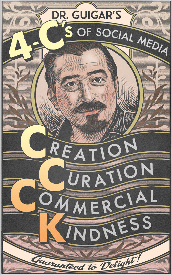
Logo Hot Seat Part Four: Concept
In discussing logos, we’ve hit legibility, negative space and typography.
The fourth key to good logo design is concept.
In other words, this is the idea behind the logo itself. Making the image (if any) work together with the type to convey something significant about the comic. It’s the hook, if you will — the spirit of the logo.
There are a lot of logos that could be improved by addressing their approach to concept. So many that I’m going to break this section into two parts.
The content you are trying to access is only available to members.
Mark Waid is (not) evil… the Harvey Awards speech and ensuing debate
When Scott Kurtz intriduced comics writer Mark Waid for his keynote address at the 2010 Harvey Awards ceremony, he referenced the phenomenon of “Mark Waid is evil” T-shirts, joking that he wanted to walk up to one of these guys with a shirt that said, “No shit.”
The content you are trying to access is only available to members.
Record-keeping tips from the IRS
As we head into the four quarter of 2010, I thought it might be a good time to go over some information that’s going to come in handy by the end of the year. Keeping good records is going to do two things. First, it’s going to help you calculate your taxes accurately and avoid any mistakes that might get you flagged for review. Secondly, in the event that you are called in for an audit, having your records in order will help you navigate the process in a much better frame of mind. All of the following links take you off-site to the IRS’s official advice on each topic.
The content you are trying to access is only available to members.
Logo Hot Seat, Part Three: Typography
In the first Logo Hot Seat, we discussed some flaws that fall under the heading of an important element of design: Legibility. In the next Hot Seat, we talked about using Negative Space to improve your logo.
In this next group of logos, I’d like to discuss another important aspect of design: Typography.
Typography is such a powerful tool. It can convey attitude and emotion. It can add amazing flavor. If you’re timid with your font choices, you logo could end up bland. And if you’re careless, you could wind up with something that tastes horrible. To your readers’ eyes.
Too bad fonts can’t be used to fix a bad metaphor.
The content you are trying to access is only available to members.
Failure is an option
This piece was kindly submitted by Patric Lewandowski.
You finally did it. You thought about it for years, but you finally started your first comic. And it’s on the web! There’s no one to stop you from reaching the masses with your comic! There’s no one to tell you “no!” And, your craft is strong! You draw well. Jokes are funny. At least, that’s what the few readers you have told you. But why don’t you have more readers? You just need to work harder, right?
The content you are trying to access is only available to members.
Buying a one-year membership in August?!
Since the question has arisen once or twice, I figured I’d better clear up any confusion.
Your Webcomics.com membership is good for twelve months after your starting date. In other words, it will not expire on Dec. 31, 2010. Rather, it will expire one year after you first subscribe.
When you subscribe, you are automatically enrolled to have your subscription renewed after one year. You have every right to cancel that auto-enroll, and it is very easy to do to. However, if you cancel the auto-renewal and forget to update your subscription, your account will be automatically locked.
Logo Hot Seat, Part Two: Negative Space
IIn the first Logo Hot Seat, we discussed some flaws that fall under the heading of an important element of design: Legibility. In this next group of logos, I’d like to discuss another important aspect of design: Negative Space.
The content you are trying to access is only available to members.
Logo Hot Seat, Part One: Legibility
As I stated in my original post on the subject, designing a good logo is an integral part of the branding of your comic and your site. During the next couple of weeks, I’m going to be grouping some of the submitted logos into groups according to the similar problems that they exhibit so we can discuss those issues one by one.
The first issue I want to discuss is legibility.
The content you are trying to access is only available to members.
Robert Khoo: Comic-Con Review
Penny Arcade has been exhibiting at San Diego Comic Con for a decade, and I can say with confidence that we’ll never get it 100% right. From shipping mistakes to inventory issues to unplanned expenses, the combination of so many moving parts in your planning process and a show that continues to evolve creates a situation that’s always error-prone.
Despite that incredibly upbeat opener, I actually hope this article will show two things: A. everyone makes mistakes so you shouldn’t feel bad when you do (and you will) and B. you shouldn’t let those mistakes haunt you.
The content you are trying to access is only available to members.


