August To-Do List
We’re well into the second half of the year, believe it or not. Now’s a great time to start planning the rest of your 2015.
The content you are trying to access is only available to members.
We’re well into the second half of the year, believe it or not. Now’s a great time to start planning the rest of your 2015.
The content you are trying to access is only available to members.
Banner advertising has always been a low-cost/high volume endeavor. (Not counting a blissful period of time before the dot-com bubble burst.) But, as more users access the Web on mobile devices — and, increasingly, through apps — that volume has decreased. (See this NYTimes piece for an excellent analysis of this.)
This has caused online advertisers to launch more and more invasive, aggressive advertising campaigns — video, pop-ups, interstitial ads, and ads that hijack your browser entirely.
And as ads become more of an intrusion, demand for ad-blocking software rises.
Which spurs even more aggressive advertising, and so on.
But, to Web publishers, the damage reaches even further than ad revenue. Tell me if the following story sounds familiar to you:
The content you are trying to access is only available to members.
You don’t need a subscription to read today’s post!
This is a re-post from the Webcomics.com archive. If you’ve ever been curious about the kind of information, tutorials and advice that you’ll get as part of your subscription to Webcomics.com, this is a good example.
If you’d like to join the site, you can get a 12-month subscription for $30 — or you can get a one-month Trial for $5 … with no obligation after your 30 days expire. For less than three bucks a month, you can get a steady flow of information, tutorials and advice targeted towards your webcomic business — plus a private forum to discuss issues with other professionally minded cartoonists.
Today’s post has been very kindly submitted by Mary Cagle:
Something that drives me crazy about a lot of cel shading is that the artist only lines the edge of their figures with shadow.
As a demonstration, here’s a recent panel of my comic shaded in such a way:

While cel shading is about simplifying forms and quickly adding depth to an image, doing it in this way completely ruins the point of shading.
Shadows should, as a minimum, give an impression of:
The problem with shading “on the edge” is that it completely ignores the latter. Whether an object is a sphere or a pyramid, it’s getting the same treatment. What this tells the eye is that all objects in the image have the same depth and shape, like a carved relief.
To help figure out the best way to use cel shading more powerfully, let’s go back to the basics.

Here are a basic sphere and cylinder, rendered realistically. If you’ve been in any art class, you probably had to do these. When they are shaded like this, you get the impression of the form through a subtle use of gradients and highlights. But we don’t always have this luxury in cel shading. We have to pick a single line along which to shade, and that line needs to define the entire form.
Now here’s two versions of the same shapes, cel shaded this time. The left has that on-the-edge shading, while the right is how I might shade these objects. See how much more round the objects on the right look?
If you work in pure black and white, you may have heard to 70/30 rule: a balanced page is often either 30% black or 70% black, with the rest being negative space. I’ll submit that a similar principle works for cel shading: a balanced shadow on a round figure will take up 30 to 70% of said figure. Going far to either side makes it look like your light source is very bright or very dim.
I think a lot of the reason people end up resorting to minimal cel shading is because they aren’t sure what shapes to make the shadows, if not a thin line. After all, character forms can be complex and hard to visualize for shading purposes.
However, I find that it helps to think of characters in terms of simplified forms, much in the same way you might construct a figure when you’re drawing them.
For instance, if we go back to my chosen panel:

On the simplest level, this character is mostly composed of distorted cylinders and a few spheroids. So while it may be hard to figure out how to shade “a face” it’s not too hard to shade a sphere that happens to have a triangle (the nose) on it and some holes in it!
That in mind, this is what the actual shaded panel ended up like:

Of course, there a number of subtleties when it comes to overlapping forms and artistic license, but I’d encourage anyone who’s hiding their shadows on the edge of their figures to try experimenting with this mindset, and let your shadows help bring depth to your world.
This critique series is called the “On The Spot” Hot Seat. I will visit participants’ sites on a random day and talk about how their comic/site/social media is on that day. No archive-diving and no overview. The point is to try to reinforce the importance of making every update significant.
For those of you who are interested in the craft of comics and cartooning, this is your opportunity to talk about the subject in a Real World setting — “workshopping” one another’s comics, if you will.
The content you are trying to access is only available to members.
One of the core concepts I’ve posted here is to be very wary of “publishers” who offer to do things that you can (and, perhaps should) do yourself. This next story is an excellent reason why I hold this opinion: Often the pseudo-publisher has little or no understanding of the business he or she is engaging in.
An excellent example just blinked across my Facebook feed. It’s from a publisher who is disgusted that Diamond Distributors has rejected his comic.
It should be titled: “I don’t have an adequate understanding (still) of how print distribution works.”
And here’s why:
The content you are trying to access is only available to members.
News sites are reporting that Google is finally abandoning Google Plus. According to Slate.com:
The company announced in a blog post Monday that it will no longer force people to use a Google Plus account to log in to other, more popular Google services. That includes YouTube, whose users have been howling for years about the Google Plus requirement. Soon they’ll be able to log in with a plain old Google account.
Google’s official blog is more reserved:
When we launched Google+, we set out to help people discover, share and connect across Google like they do in real life. While we got certain things right, we made a few choices that, in hindsight, we’ve needed to rethink. So over the next few months, we’re going to be making some important changes.
The content you are trying to access is only available to members.
Comics Beat has a think piece that wonders aloud if it’s possible to host a mega-comic-con in Las Vegas. We all understand that there already are comic conventions in Sin City. The question is whether it’s possible to host something on the scale of Comics Con International or New York Comic Con there.
Comics Beat says that it could happen.
Don’t bet on it.
And here is the main reason why:
The content you are trying to access is only available to members.
In dating, “ghosting” has become the term for a situation in which one partner simply “disappears” from the relationship with no explanation. In Patreon, a “ghost patron” signs up to pledge at a certain level — helping himself or herself to the rewards and exclusive content available at that level — and then removes his or her pledge before the end of the month (when the credit cards are charged).
As I’ve reported here, Patreon is making promises to address this problem in its next update. But we don’t have a timeline for that, and while we wait in joyful hope for it to happen, many of us (particularly the NSFW creators) are getting taken advantage of by these ghosts.
So, in the meantime, let’s talk about a few ways to be proactive on Ghost Pledges.
The content you are trying to access is only available to members.
You don’t need a subscription to read today’s post!
This is a re-post from the Webcomics.com archive. If you’ve ever been curious about the kind of information, tutorials and advice that you’ll get as part of your subscription to Webcomics.com, this is a good example.
If you’d like to join the site, you can get a 12-month subscription for $30 — or you can get a one-month Trial for $5 … with no obligation after your 30 days expire. For less than three bucks a month, you can get a steady flow of information, tutorials and advice targeted towards your webcomic business — plus a private forum to discuss issues with other professionally minded cartoonists.
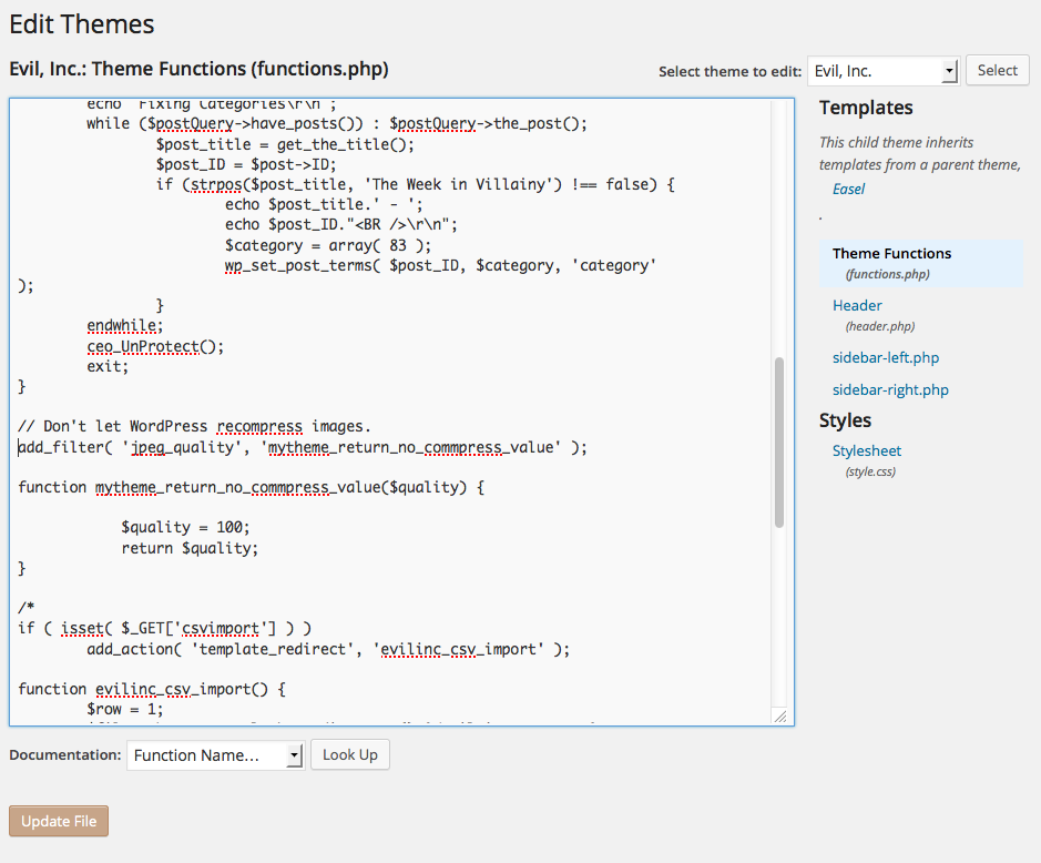
When I was forced to change Content Management Systems recently, I had the opportunity to give my existing Web design a couple of tweaks. And one of the most important ones was ad placement.
Ad placement is one of the primary factors in making more money from your advertising. After all, advertisers are paying for exposure, and if you’re not giving them that, you’re missing out.
Google has a much-passed-around “heat map” of site content (as seen on the right). This is based off research that they’ve done through AdSense to determine which placements of ads deliver the best user response.
To the right is the previous Evil Inc site layout. It made use of a leaderboard at at the very top and two skyscrapers on either side of the blog.
Below that is how the Google heat map related to that old design.
On a traditional webcomic site layout, you have four main, above-the-fold hot spots:
Here are a few thoughts on how you can maximize your hot spots — to not only improve your ad revenue but to increase the effectiveness of your reader-outreach as well.
Leaderboard: ‘Nuff said. The leaderboard goes at the top of the site. Nothing new here unless you don’t currently have a leaderboard.
Comic: Don’t underestimate the power of using the space directly above and below the comic. Comic Easel / WordPress has this functionality built in. Certainly, you could use this for simple advertising, but I find it much more valuable to use this space to send my readers important messages. Currently I have the above-the-comic space on my site serving a steady rotation of house ads through Google DFP. They can only be replaced by paid ads at a ridiculously high CPM. Oddly enough, I see paid advertising in that place from time to time.
Below comic: This is usually where most of us place our blogs, but it can also be a space for a shallow horizontal ad (like a banner). This can also be a good place for native advertising or promotion for your site or collective.
Below comic, on the left: I actually modified the original Comic Easel layout specifically because I wanted to get a bigger ad into that left-hand sidebar. Right now, I have a 300×250 ad at the top of that sidebar, and I’m experimenting with a whopping 300×600 ad at the bottom of the same sidebar. Bottom line: This is prime real estate that many of us are undervaluing.
My new site design took a few steps towards maximizing the hot spots.
Patreon’s Taryn Arnold, from their Community Happiness team, has released an e-mail to creators that promises some crucial improvement to the standout crowdfunding platform.
Here’s what you need to know…
The content you are trying to access is only available to members.