Manga-inspired word balloons — and why you might want to rethink them
It’s pretty easy to see the influence of manga on comics being produced today. Scrolling through Webtoons, it’s obvious that an entire generation of young comics creators cut their teeth on comics originally made in Japan. In general, that’s tremendous! The creativity, the kinetic energy, the jaw-dropping art — it’s all worthy of emulation.
But when it comes to word balloons, something’s getting lost in the translation.
Cargo Cults
I discussed Cargo Cults recently on Webcomics Confidential.
In short, Cargo Cult thinking happens like this:
- A person sees someone else doing something enviable
- That person mimics the actions without learning why (or how) those activities produce the outcomes they desire
- Often these mimicked actions has unintentional consequences
We’re all guilty of cargo-cult thinking at different stages of our progression as cartoonists. It’s a pretty natural way of learning behavior. However, it’s those unintended consequences that cause problems.
Lost in translation

As any manga fan can tell you, Japanese writing is different than English. It reads right-to-left — whereas we read left-to-right. And Japanese characters are stacked vertically to form sentences — which is much different than English sentences that are formed horizontally.
As a result, Japanese word balloons have to be vertical to contain Japanese writing.
In order to make their comics readable by English-speaking audiences. Japanese publishers had to erase the Japanese lettering in those vertical word balloons and replace them with their English translations. Since (in most cases) the art was final, the word balloons were not able to be reshaped. Therefore, those English sentences had to be made to fit inside the existing balloons.
And they rarely fit perfectly.
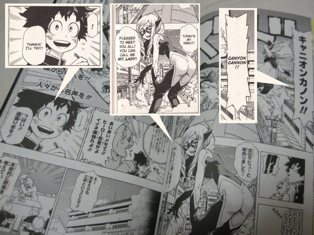
Often, the English version took up less space — leaving awkward amounts of white space above and below the text inside the word balloons. Here’s an example from My Hero Academia, Vol. 1.

Unfortunately, there’s just no easy way around it, and nearly every manga translated from Japanese features these awkward word balloons.
Learning by example
Enter an entire generation of younger cartoonists for whom these English-translated comics were their first exposure to sequential art. From their standpoint, this is how word balloons are supposed to look.
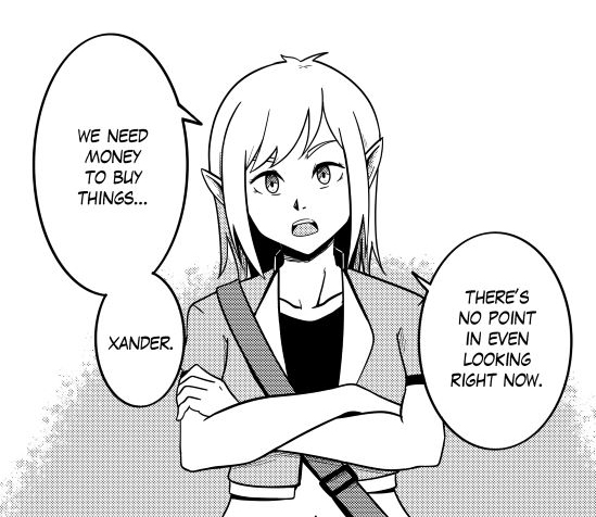
Scroll through Webtoons — which is dominated by heavily manga-inspired offerings — and you’ll see that it’s pervasive. Here’s a page from a webcomic I consulted on recently, LandxSky. Remember, it was originally created in English.

Why it’s worth addressing
On one hand, we could treat this like slang language. For example, in school you were told that “ain’t” isn’t a word. But it’s used so ubiquitously, that it might as well be. Heck even words that are downright nonsense like “irregardless” have even made their way into dictionaries.
So if an entire generation of creators thinks that this is the way word balloons should look, why bother them.
Three reasons: Communication, composition and phrasing
First of all, word balloons are incredibly powerful. A well-designed word balloon can convey an entire spectrum of emotions. For example, we can use that extra space inside a word balloon to indicate a whisper. And a well-balanced word-balloon is conducive to a clean, easy reading experience. That’s crucial. If your comic is challenging to read, people are going to avoid it.
Secondly, a word balloon that wastes that amount of visual space is having a negative effect on your panel composition. In other words, a panel is a finite space, and we, as comics creators, are trying to use that space as efficiently and effectively to balance words, images and other intangibles to construct a pleasant reading experience. Simply put — we don’t have the luxury of wasted space.

Finally: phrasing. Cramming horizontal sentences into a vertical structure makes good phrasing nearly impossible. For example, take the example to the right. It reads like this:
WE NEED
MONEY
TO BUY
THINGS.
However, that’s not how that sentence should be phrased. And a good word balloon should guide that phrasing. It would read much better like this:
WE NEED MONEY
TO BUY THINGS.
…but that requires a more horizontal word balloon.
Functional word balloons
In 1896, architect Louis Sullivan became famous for the phrase “form follows function.” He insisted that a skyscraper’s exterior design should reflect the different interior functions.
Word balloons are no different. Their form should reflect the structure of the words they’re designed to present.


Recent comments