• Home
  • Contact
  • FAQs
    • What is Webcomics.com?
    • Member Benefits
    • How To Post an Article or News Item
    • How to Post a Webcomic on the List
    • How to Post a Comic
    • Terms of Service
  • Forums
  • WebComics List
  • Benefits
    • Print Vendors: Get multiple quotes
    • Banner stand: Discount
    • Consultation discount
    • “How To Make Webcomics” book: discount
    • “Webcomics Handbook”: discount
    • ALL benefits
  • My Account
    • Welcome
    • What is Webcomics.com?
    • My Subscription
    • Join us!
  • Account
  • Membership List
Twitter Email RSS

Webcomics.com

How To Make WebComics

Webcomics Handbook

‹ Best of Webcomics.com — August 2016 24-Hour Comics Day ›

Ames Lettering Guide

You don’t need a subscription to read today’s post!

This is a re-post from the Webcomics.com archive. If you’ve ever been curious about the kind of information, tutorials and advice that you’ll get as part of your subscription to Webcomics.com, this is a good example.

If you’d like to join the site, you can get a 12-month subscription for $30 — or you can get a one-month Trial for $5 … with no obligation after your 30 days expire.  For less than three bucks a month, you can get a steady flow of information, tutorials and advice targeted towards your webcomic business — plus a private forum to discuss issues with other professionally minded cartoonists.

The Ames Lettering Guide is a little daunting when you begin to use it. For general use, I’m going to suggest ignoring the holes on the left-hand side of the tool as well as the metric measurements.

Typography terms

Before we get started, let’s cover some typography terms.

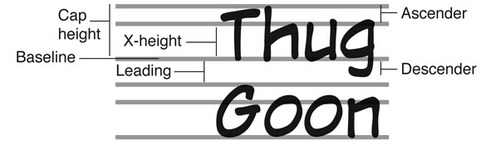
You can use the Ames tool to measure out Cap height, X-height and leading. It’s an ingenious little tool. Here’s how it works.
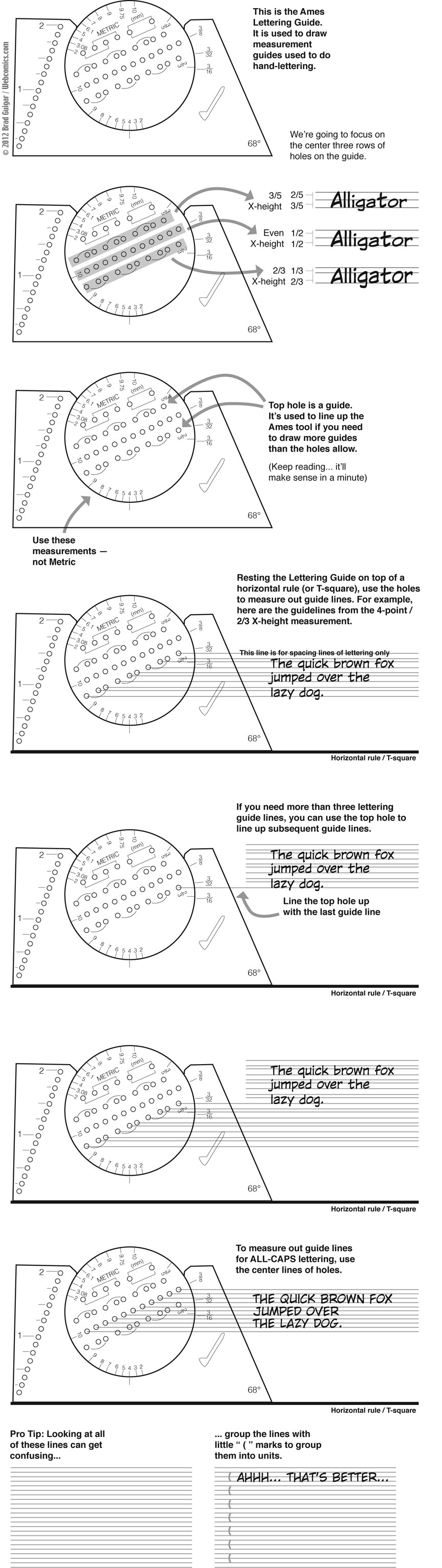
All-caps lettering

For cartoonists lettering in all-caps, that center row of dots is really useful. It allows you to measure out the Cap-height with an X-height that falls into dead center. Finally, it gives you leading that is exactly half the size of the Cap-height — which is also a typographical rule-of-thumb.

Even though you’re not using lowercase letters, that X-height rule is amazingly useful in helping you to place different components of uppercase letters, for example:

  • The crossbar of an H and E can be placed directly on the X-height line.
  • The crossbar of the letter A should be slightly lower — to open up that triangle it creates inside the letter.
  • The top loop of B should end a little above the X-height line — the bottom loop should be larger.
  • The top loop of P and R should extend a little below the X-height line. (Again, this opens up the negative space inside the shape of the letter.)

Share this:

  • Facebook
  • Twitter
by Brad Guigar on September 2, 2016
Posted In: Lettering
Comments available to logged in users only.


Recent comments

  • hpkomic on Managing commissions
  • Brad Guigar on Tweet and sour
  • Kulanah on Tweet and sour
  • Kulanah on Tweet and sour
  • Andrew Fraser on Tweet and sour

Search


Webcomics.com Poll

I design my comic specifically for smartphones and digital tablets.

  • Disagree (52%, 178 Votes)
  • Agree (48%, 166 Votes)

Total Voters: 344

Loading ... Loading ...
  • Polls Archive

Categories

  • Archive Dive
  • Articles
    • Advertising
    • Art
    • Business
    • Community
    • Conventions
    • Creativity
    • Crowdfunding
    • Digital publishing
    • Image prep
    • Lettering
    • Marketing / Social Media
    • Merchandise
    • Print publishing
    • Tech
    • Web site
      • Web Site Design
    • Writing
  • ComicLab
  • Edited and Ready
  • Events
  • Guest
  • Hot Seat critiques
  • Information
  • Interviews
  • Livestream Chat
  • Mail Bag
  • Member Benefits
  • Promos
  • Site News
  • Surviving Creativity
  • To-Do List
  • Uncategorized
  • Video
  • Webcomics Confidential
  • Webcomics Weekly
  • Webcomics.com Poll

Tags

ad revenue AdSense advertising Comic Easel comments composition contract copyright creativity exercise credit cards Crowdfunding digital lettering digital publishing Facebook holiday Humor IP KDP Kickstarter Kindle legal lettering line weight Longform comics Manga Studio merchandise NCS panels Patreon Promotion PulsePoint readers revenue SEO shipping social media Square taxes trademark Twitter typography Web design word balloons WordPress writing

Special Features

Just now, in the forum…

  • Navigation advice
  • Mixing First and Third Person Captions
  • Help with Toocheke
  • Label Printer for shipping
  • Patreon Merch

Recent Posts

  • Patreon Mistakes That Cost You Money
  • Pitfalls of paid advertising
  • ComicLab Ep 274 — Nobody does thumbnails
  • “Where should I post my comic?”
  • Using “house ads” to improve your revenue

Recent Replies

  • Brad Guigar on Navigation advice
  • Brad Guigar on Mixing First and Third Person Captions
  • Brad Guigar on Help with Toocheke
  • Brad Guigar on Label Printer for shipping
  • Andrew Fraser on Label Printer for shipping

Recent Topics

  • Navigation advice by KevinWayneW
  • Mixing First and Third Person Captions by jpactor
  • Help with Toocheke by Andrew Fraser
  • Label Printer for shipping by Andrew Fraser
  • Patreon Merch by Jaycee Knight

Recent Comments

  • hpkomic on Managing commissions
  • Brad Guigar on Tweet and sour
  • Kulanah on Tweet and sour
  • Kulanah on Tweet and sour
  • Andrew Fraser on Tweet and sour
  • My Subscription
  • Store
  • Terms of Service
  • Account
  • Membership List

©2007-2023 Webcomics.com | Powered by WordPress with ComicPress | Subscribe: RSS | Back to Top ↑