To Alias — or to Anti-Alias — That is the Question
You don’t need a subscription to read today’s post!
This is a re-post from the Webcomics.com archive. If you’ve ever been curious about the kind of information, tutorials and advice that you’ll get as part of your subscription to Webcomics.com, this is a good example.
If you’d like to join the site, you can get a 12-month subscription for $30 — or you can get a one-month Trial for $5 … with no obligation after your 30 days expire. For less than three bucks a month, you can get a steady flow of information, tutorials and advice targeted towards your webcomic business — plus a private forum to discuss issues with other professionally minded cartoonists.
Aliasing vs Anti-Aliasing
So, what does aliasing mean, anyway? Strictly speaking, thisa digital method of making graphics and text (especially text) appear smoother and sharper by resampling the edges at a lower resolution. Here’s an example (click on it to see the image enlarged):
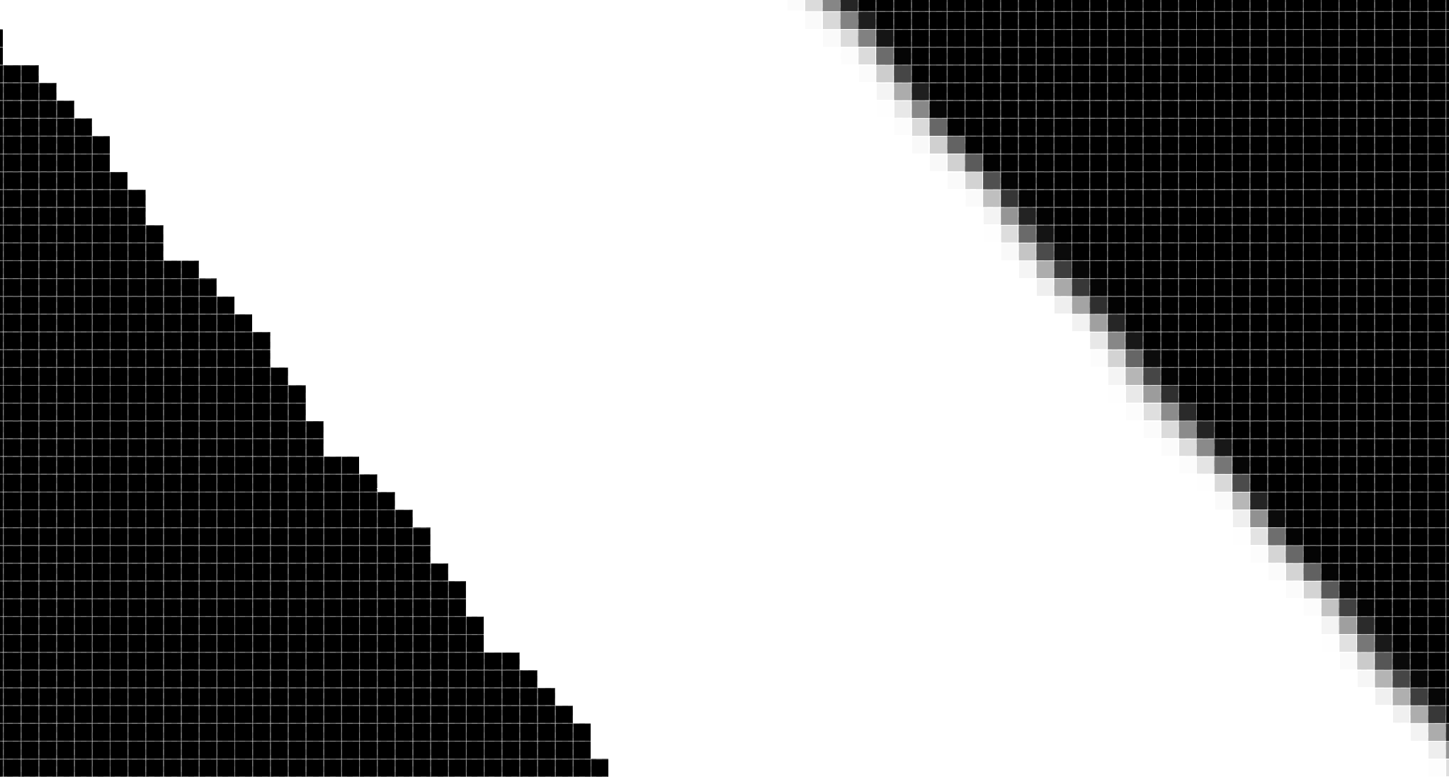
• The line on the left is aliased — meaning it is solely comprised of solid pixels (black, in this case).
• The line on the right is anti-aliased — meaning the edge has been slightly obscured with grey pixels.
So, which is better?
As in the case, the answer is subjective — provided the resolution is high enough.
That’s key, by the way. Aliased lines (and type) don’t look so hot at low resolutions. They tend to look jagged.
The same goes for type. If you remove the anti-aliasing from type, it will look very jagged on your screen. Provides you’re working at a high enough resolution, however, it will print fine. Many of the Evil Inc graphic novels were printed using aliased (jagged) type at 300 dpi. The only time the jaggedness became noticeable was when I enlarged the files. At 100% — and even reduced — the type and lines looked perfectly sharp. In the cases in which I used anti-aliased lines and art, I didn’t notice a loss of sharpness — and I was able to get away with a little bit of enlargement (again, at 300 dpi).
ANALOG ART, USING ALIASED ART
If you’re scanning in black-and-white lineart, you’ll want to make your initial scan at least 600 dpi. Higher, if you can manage.
Scan in bitmap, black-and-white or lineart mode. If these aren’t available, scan in Grayscale mode and do the following:
• Do the original scan in grayscale (or, barring that, color mode — and then in Photoshop, switch to grayscale).
• Once you’ve completed the initial scan, open the file in Photoshop.
• Go to Image -> Adjustments -> Threshold
• You can play with the slider, but I generally set mine between 110 and 130.
What Threshold does is assign every pixel one of two values: 100% black or 100% white. As of now — technically — you have a bitmap image. That slider merely sets the value of gray that will be used as the cut-off point between the two values. In other words, all of the grays that are lighter than that point will become white and everything that is darker will become black.
It looks jaggy on your screen, but as long as you’re working at a high resolution, it will print just fine.
By the way, if you want to save this file as a master copy of the b&w lineart, do a Save As, go to Image -> Mode -> Bitmap and save as a TIFF. Like I said, you basically created a bitmap file, saving in bitmap mode crunches that file size down to practically nothing, and makes it easy to archive your b&w master files without taking up much space. Just remember to convert it back to grayscale if you ever go back to it to edit it or add color.
To color these kinds of files:
• Switch to RGB or CMYK mode — depending on your process.
• Duplicate the lineart and save that on a higher level. Choose Darken for that level and lock it. That’s your lineart level.
• Name the lower clone “Color” and do your coloring there. If you turn off anti-aliasing on the fill bucket tool, you’ll see that the colors run right up to the edge of the line (with no unsightly border between the two).
ANALOG ART, USING ANTI-ALIASED ART
Again, make your initial scan at least 600 dpi. Higher, if you can manage.
You could scan in Grayscale mode and proceed to the coloring step. However, in my own work, I chose to alias the lineart:
• Do the original scan in grayscale (or, barring that, color mode — and then in Photoshop, switch to grayscale).
• Once you’ve completed the initial scan, open the file in Photoshop.
• Go to Image -> Adjustments -> Threshold
• You can play with the slider, but I generally set mine between 110 and 130.
What Threshold does is assign every pixel one of two values: 100% black or 100% white. As of now — technically — you have a bitmap image. That slider merely sets the value of gray that will be used as the cut-off point between the two values. In other words, all of the grays that are lighter than that point will become white and everything that is darker will become black.
Same as before, if you want to save this file as a master copy of the b&w lineart, do a Save As, go to Image -> Mode -> Bitmap and save as a TIFF. Like I said, you basically created a bitmap file, saving in bitmap mode crunches that file size down to practically nothing, and makes it easy to archive your b&w master files without taking up much space. Just remember to convert it back to grayscale if you ever go back to it to edit it or add color.
To color these kinds of files:
• Switch to RGB or CMYK mode — depending on your process.
• Duplicate the lineart and save that on a higher level. Choose Darken for that level and lock it. That’s your lineart level.
• Name the lower clone “Color” and do your coloring there. However, instead of using the Fill Bucket tool, you’ll want to use a version of the Photoshop Action described in this post.
DIGITAL ART, ALIASED
To get an aliased line in a digital piece, choose the pencil tool instead of the brush tool. To color:
• Switch to RGB or CMYK mode — depending on your process.
• Duplicate the lineart and save that on a higher level. Choose Darken for that level and lock it. That’s your lineart level.
• Name the lower clone “Color” and do your coloring there. If you turn off anti-aliasing on the fill bucket tool, you’ll see that the colors run right up to the edge of the line (with no unsightly border between the two).
DIGITAL ART, ANTI-ALIASED
To get an aliased line in a digital piece, choose the brush tool instead of the pencil tool. To color:
• Switch to RGB or CMYK mode — depending on your process.
• Duplicate the lineart and save that on a higher level. Choose Darken for that level and lock it. That’s your lineart level.
• Name the lower clone “Color” and do your coloring there. However, instead of using the Fill Bucket tool, you’ll want to use a version of the Photoshop Action described in this post.
Bottom line
Which is best? That depends on what you’re looking for in the art. For me, since I work digitally, I prefer the anti-aliased look. Remember, those Frenden brushes everybody loves are mostly brush tools — not pencil tools. In other words, they rely on anti-aliasing to deliver the intended effects.
When I was drawing by hand, I definitely favored scanning in at a huge resolution and aliasing the text line art. However, it has to be noted that as soon as I reduced the file to 300 dpi to add the colors, I introduced a certain amount of anti-aliasing. And reducing it for the Web introduced even more anti-aliasing. However, if I was scanning in lineart with the sole intention of print, I would scan in the image at the final resolution — and aliased — and then make use of the speed advantages of filling areas with color using the Fill Bucket tool.


Recent comments