Friday Archive Dive: Word Balloon Aesthetics
You don’t need a subscription to read today’s Friday Archive Dive!
Even if you’re not a member of the site, you can read the entire post, which originally ran Feb. 16, 2010. If you’ve ever been curious about the kind of information, tutorials and advice that you’ll get as part of your subscription to Webcomics.com, this is a good sample.
If you’d like to join the site, you can get a 12-month subscription for $30 — or you can get a one-month Trial for $5 … with no obligation after your 30 days expire.
Word balloons are so common — so freely accepted as a part of a cartoonist’s visual syntax — that many of us haven’t given the subject a whole lot of thought. Looking back at my own work, I know I didn’t for the first several years. If you haven’t read the post on Three Common Word-Balloon Mistakes, take a second and look it over. It provides some good structure for today’s discussion.
And, as is the case with any discussion of aesthetics, these are not meant to be taken as written-in-stone dictates. But the philosophy behind the aesthetics should help inform your own process in developing your own personal style.
It’s time to look at word balloons again for the first time.
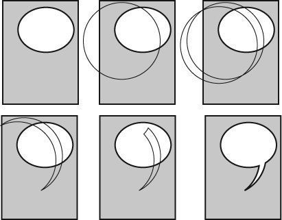
Basic construction
There are several ways to make word balloons. Put the tern into a search using the button at the top of this page and you’ll find several.
But, for my taste, all good word balloons share some traits:
- The body of the balloon is circular — not rectangular
- The tail should has slight curve to it and points to the speaker’s mouth
- Tails never cross
- Text is centered — vertically and horizontally in the body of the balloon.
- The style of the balloon matches or compliments the style of the illustration
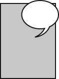
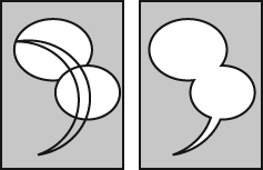
In the first panel of the example below, you can spot both crossed tails and tails that fail to point out the speaker.

Although, I’ll admit, the most entertaining part of the strip is imagining a jumbo jet intoning: “Who is paying you to release those birds?”
Process
Here’s my process. I draw my balloons using a circle template, but you can get the same effect digitally by drawing actual ellipses and applying vector commands (such as Punch and Union in FreeHand; Pathfinder -> Subtract and Pathfinder -> Add in InDesign or Illustrator).
Balloon placement
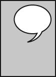
Standard: OK, now that you know how to do an elegant-looking word balloon, what do you do with it? Well, aside from pointing the tail to the speaker’s mouth, there’s not much left to it, right? Wrong. There are many different strategies for placing a balloon in a panel — and each has a benefit in terms of composition and text handling. So, let’s get the obvious out of the way. This is a standard placement. There’s a little space between the panel borders and the balloon. It’s equidistance from both the top and the right-hand border.
Docking: Of course, you can butt the balloon up against the panel border.
I’ve seen this referred to as “docking.”
I have to admit, I’m not crazy about the look, but it eliminates dead space above the text (and to one side, if you dock it to the top and side of the panel), so it’s a favorite for getting more words into a panel.
Remember, docking the balloon doesn’t eliminate the necessity to keep a consistent spacing between the text and the borders of the balloon.
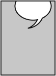
Knock-out: I remember the first time I saw this technique. It was in a Hagar the Horrible strip. I immediately fell in love with how it opened up the otherwise cramped confines of the newspaper-strip set-up.
I use this one quite a bit in my comics. The secret to doing it well, I think, is not to get too close to the corner. See that little triangle that gets formed in the upper right of the example? If that triangle gets too small. the effect gets wonky. Of course, you can always make the body of the balloon so big that it eliminates the triangle entirely. But, again, to my taste, it’s not as elegant an effect.
 Overlap: Scott uses an overlapped word balloon in PvP quite often.
Paired with a transparent PNG file, he gets a really cool effect on his site.
I think the key to using this technique is restraint. Floating the balloon too far away creates a disconnect between the balloon and the panel — which is counter-productive.
The two should work as a unit.
Bridge: Now, I’d been reading comics since the late 70s — and working on them since the late 90s. And I’d never taken notice of this approach until a couple years back, when I was paging through an old Batman comic and saw this.
I gotta tell you, I think this strategy is brilliant.
I can tell you from experience that it sets up some really interesting compositions and — since some of the space that it uses comes out of the gutter — it’s a good way to get more words in.
I can also tell you from experience that the key to doing this well is keeping the tail away from the gutter. If you get it too close, it looks awkward.
Special Balloons
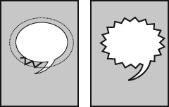
Burst balloon: If you’re doing this digitally, doing a starburst is pretty simple, but hand-drawing a starburst can get a little tricky.
Here’s what I do. I start by pencilling a standard word balloon and then I draw a larger ellipse around the body of the balloon.
Then I draw a zig-zag line between the two guides.
If I keep the angles roughly consistent, I can make it all the way around without it looking ugly.
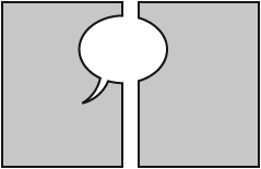
Compound balloon (1): You can divide the word balloon of a single speaker in the same panel.
This is useful if the speaker is interrupted by another speaker or if the speaker is delivering two separate thoughts in the same panel. Or, heck, it’s even a darned useful way to indicate a pause.
I prefer the connector tail to be a natural extension of the balloon tail.
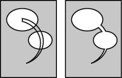
Compound balloon (2): Of course, there’s nothing that says that you need a connector tail between the two parts of a compound balloon.
You might choose to mash both balloons together. But, again, in choosing where to intersect the two balloons, I try to position them so they meet in the zone indicated by the tail.


Recent comments