• Home
  • Contact
  • FAQs
    • What is Webcomics.com?
    • Member Benefits
    • How To Post an Article or News Item
    • How to Post a Webcomic on the List
    • How to Post a Comic
    • Terms of Service
  • Forums
  • WebComics List
  • Benefits
    • Print Vendors: Get multiple quotes
    • Banner stand: Discount
    • Consultation discount
    • “How To Make Webcomics” book: discount
    • “Webcomics Handbook”: discount
    • ALL benefits
  • My Account
    • Welcome
    • What is Webcomics.com?
    • My Subscription
    • Join us!
  • Account
  • Membership List
Twitter Email RSS

Webcomics.com

How To Make WebComics

Webcomics Handbook

‹ The Overnight Test Site Feature: Get Competing Bids on Print Vendors ›

Hitch it / Ditch it: Within a Mile of Home, Pepperpot Piper

This is the final Hitch It / Ditch it critique  for 2012. This has been one of the most popular hot seats on Webcomics.com. You know the drill. I review participating webcartoonists and list one thing I think they’re doing well and one thing I think needs improvement. Then I open up the topic for discussion among the members. Links to the comics being discussed are in the headers.

Within a Mile of Home

Hitch it: Although it’s extremely hard to read/navigate, I really appreciate that the site has a guide to the world that the creators are building.

Ditch It: We’ve got a littany of the usual faults here. The header is drab and hard to read. In fact, it recesses so much, the site seems to read as if the leaderboard is the title of the strip. The navigation buttons are hard to read, and the buttons above the comic are over the ad instead of the comic. The individual updates are impossible to understand without reading most or all of the backstory. And so on. But the art is so close to being really good I can’t resist pointing it out. And I’ve posted so often about paying attention to line weight that I feel like I’m beating a dead horse. Nonetheless.

To my eye, that qualifies as a night-and-day difference. Just a little heaviness in the line where the shadows would be (and a little emphasis on making the outline of the foreground figure a little heavier) and those visuals just come to life. The foreground is clearly defined from the background. The character has life. The figures are a little more modeled in a three-dimensional sense. And it’s so freaking easy to do. Wanna make your comic look better overnight? Line weight.

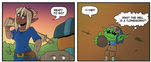
Pepperpot Piper

Hitch it: Jeez. Do I need to say it? The art on this comic is phenomenal. It’s not good. It’s not great. It’s in a class by itself. I’m running out of superlatives to describe it. It’s beyond beyond.

Ditch It: There’s just no way you can uppdate this comic fast enough is you’re posting these as you’re doing them. In this case, I think you’d be much better off completing the project and then posting them on a regular schedule. I don’t care how freaking beautify this is… once a reader loses interest in a comic that doesn’t seem to be updating, they’re usually gone forever.
by Brad Guigar on November 13, 2012
Posted In: Hot Seat critiques
└ Tags: line weight
Comments available to logged in users only.


Recent comments

  • hpkomic on Managing commissions
  • Brad Guigar on Tweet and sour
  • Kulanah on Tweet and sour
  • Kulanah on Tweet and sour
  • Andrew Fraser on Tweet and sour

Search


Webcomics.com Poll

I design my comic specifically for smartphones and digital tablets.

  • Disagree (52%, 178 Votes)
  • Agree (48%, 165 Votes)

Total Voters: 343

Loading ... Loading ...
  • Polls Archive

Categories

  • Archive Dive
  • Articles
    • Advertising
    • Art
    • Business
    • Community
    • Conventions
    • Creativity
    • Crowdfunding
    • Digital publishing
    • Image prep
    • Lettering
    • Marketing / Social Media
    • Merchandise
    • Print publishing
    • Tech
    • Web site
      • Web Site Design
    • Writing
  • ComicLab
  • Edited and Ready
  • Events
  • Guest
  • Hot Seat critiques
  • Information
  • Interviews
  • Livestream Chat
  • Mail Bag
  • Member Benefits
  • Promos
  • Site News
  • Studios
  • Surviving Creativity
  • To-Do List
  • Uncategorized
  • Video
  • Webcomics Confidential
  • Webcomics Weekly
  • Webcomics.com Poll

Tags

AdSense advertising Comic Easel comments composition contract copyright creativity exercise credit cards Crowdfunding digital lettering digital publishing Facebook Google Analytics holiday Humor IP KDP Kickstarter Kindle legal lettering line weight Longform comics Manga Studio merchandise NCS panels Patreon Promotion PulsePoint readers revenue SEO shipping social media Square taxes trademark Twitter typography Web design word balloons WordPress writing

Special Features

Just now, in the forum…

  • Mixing First and Third Person Captions
  • Help with Toocheke
  • Label Printer for shipping
  • Patreon Merch
  • Pricing Your Comics

Recent Posts

  • Blambot sale
  • February To-Do List
  • ComicLab Ep 267 — How to turn OFF creativity
  • How to find your drawing style
  • Eisner Awards — Call for Entries

Recent Replies

  • Brad Guigar on Mixing First and Third Person Captions
  • Brad Guigar on Help with Toocheke
  • Brad Guigar on Label Printer for shipping
  • Andrew Fraser on Label Printer for shipping
  • Brad Guigar on Label Printer for shipping

Recent Topics

  • Mixing First and Third Person Captions by jpactor
  • Help with Toocheke by Andrew Fraser
  • Label Printer for shipping by Andrew Fraser
  • Patreon Merch by Jaycee Knight
  • Pricing Your Comics by Jaycee Knight

Recent Comments

  • hpkomic on Managing commissions
  • Brad Guigar on Tweet and sour
  • Kulanah on Tweet and sour
  • Kulanah on Tweet and sour
  • Andrew Fraser on Tweet and sour
  • My Subscription
  • Store
  • Terms of Service
  • Account
  • Membership List

©2007-2023 Webcomics.com | Powered by WordPress with ComicPress | Subscribe: RSS | Back to Top ↑