The danger of shading on the edge
You don’t need a subscription to read today’s post!
This is a re-post from the Webcomics.com archive. If you’ve ever been curious about the kind of information, tutorials and advice that you’ll get as part of your subscription to Webcomics.com, this is a good example.
If you’d like to join the site, you can get a 12-month subscription for $30 — or you can get a one-month Trial for $5 … with no obligation after your 30 days expire. For less than three bucks a month, you can get a steady flow of information, tutorials and advice targeted towards your webcomic business — plus a private forum to discuss issues with other professionally minded cartoonists.
Today’s post has been very kindly submitted by Mary Cagle:
Something that drives me crazy about a lot of cel shading is that the artist only lines the edge of their figures with shadow.
As a demonstration, here’s a recent panel of my comic shaded in such a way:

While cel shading is about simplifying forms and quickly adding depth to an image, doing it in this way completely ruins the point of shading.
Shadows should, as a minimum, give an impression of:
- The light source
- The form of the object being shaded
The problem with shading “on the edge” is that it completely ignores the latter. Whether an object is a sphere or a pyramid, it’s getting the same treatment. What this tells the eye is that all objects in the image have the same depth and shape, like a carved relief.
To help figure out the best way to use cel shading more powerfully, let’s go back to the basics.
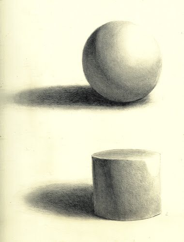
Here are a basic sphere and cylinder, rendered realistically. If you’ve been in any art class, you probably had to do these. When they are shaded like this, you get the impression of the form through a subtle use of gradients and highlights. But we don’t always have this luxury in cel shading. We have to pick a single line along which to shade, and that line needs to define the entire form.
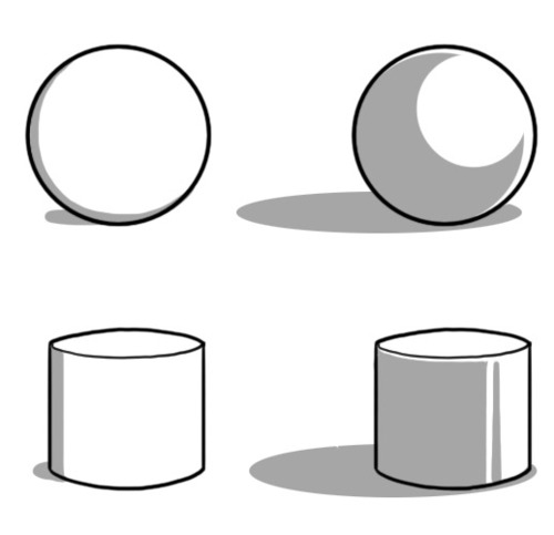 Now here’s two versions of the same shapes, cel shaded this time. The left has that on-the-edge shading, while the right is how I might shade these objects. See how much more round the objects on the right look?
If you work in pure black and white, you may have heard to 70/30 rule: a balanced page is often either 30% black or 70% black, with the rest being negative space. I’ll submit that a similar principle works for cel shading: a balanced shadow on a round figure will take up 30 to 70% of said figure. Going far to either side makes it look like your light source is very bright or very dim.
I think a lot of the reason people end up resorting to minimal cel shading is because they aren’t sure what shapes to make the shadows, if not a thin line. After all, character forms can be complex and hard to visualize for shading purposes.
However, I find that it helps to think of characters in terms of simplified forms, much in the same way you might construct a figure when you’re drawing them.
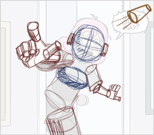
For instance, if we go back to my chosen panel:
On the simplest level, this character is mostly composed of distorted cylinders and a few spheroids. So while it may be hard to figure out how to shade “a face” it’s not too hard to shade a sphere that happens to have a triangle (the nose) on it and some holes in it!
That in mind, this is what the actual shaded panel ended up like:

Of course, there a number of subtleties when it comes to overlapping forms and artistic license, but I’d encourage anyone who’s hiding their shadows on the edge of their figures to try experimenting with this mindset, and let your shadows help bring depth to your world.


Recent comments