Sarah Frisk
Forum Replies Created
-
AuthorPosts
-
Sarah Frisk
ParticipantCount me in! My time zone is (UTC-05:00) Eastern Time, and I’m normally available after nine.
ParticipantI would have to agree with Clay on rates. $25 tends to be the ‘friend’ rate for me, I charge more than that for most freelance coding work I do. I am not totally confident with my design abilities (although I’m getting better), so I tend to code based off of a design someone gave me. This worked well for the webcomic site I coded up for a friend, and I just made suggestions here and there based on what would probably be easier/less load intensive/best practices for web sites.
-
This reply was modified 9 years, 6 months ago by
Sarah Frisk.
ParticipantMy day job is software development, and I do a lot of web work for my job, so I applied a lot of that knowledge for making my website. The first year of my comic, I did go the tumblr route, and after that I switched to the WordPress with the easel plugin route with a custom theme (based off of Bones).
-
This reply was modified 9 years, 6 months ago by
ParticipantIt looks at the color palettes used in movies rather than comics, but can be useful in helping you pick out colors that work well together.
ParticipantGood article! It made a lot of good points about comic hosting.
I ended up switching to Digital Ocean a few weeks ago after a few years on shared hosting. While shared hosting was okay when I started making websites six years ago for myself and friends, I found for my current needs it lagged a lot. This happened especially in the WordPress admin area, where the server was taking 5-10 seconds just to respond.
I will say, the transfer process was painless, minus one gotcha moment that was totally my fault. Also Digital Ocean has a crazy number of tutorials of setting up a site with WordPress on it, and how to transfer an existing WordPress site over.
ParticipantThe “Be the first to like this.” text is overlapping your name at the bottom of your posts.

The issue seems to be coming from
div.jetpack-likes-widget-wrapper {
width: 100%;
height: 50px;
position: relative;
}
The content within this div is actually taller than 50px, but everything around it is treating it like it’s only 50px high. Setting the height of “div.jetpack-likes-widget-wrapper” to ‘auto’ should fix this.
 Participant
I have different chairs depending on where I am. If I’m in my apartment, I tend to work on my couch, both for digital drawings and regular art. At the coffee shop I like working from, I’m normally sitting either on a tall bar stool, or I’m standing next to the bar. The only time I ever have a ‘typical’ chair for art/work is if I happen to be working on my comic during my lunch break. Then I just use a typical office desk chair.
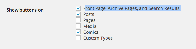
ParticipantAs for the Jetpack share icons not showing. Go to Jetpack -> Sharing -> Configure (Page title should be “Sharing Settings”)
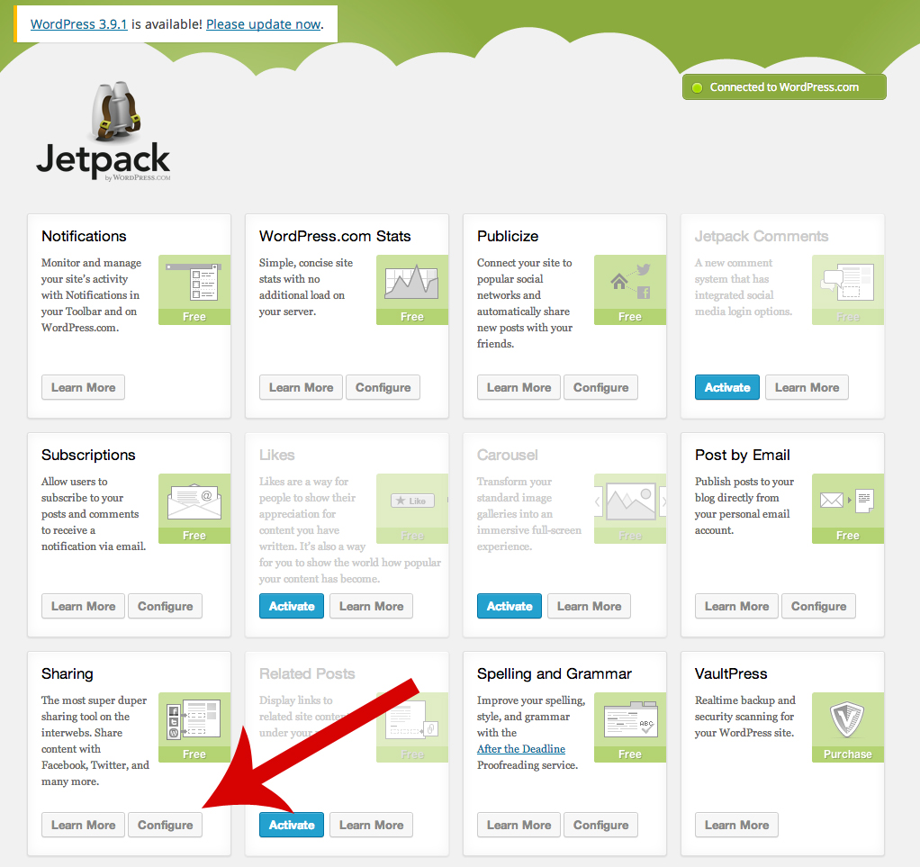
Scroll down to the bottom of the page to where it says “Show buttons on” and make sure “Front Page, Archive Pages, and Search Results ” is checked off. That should make sure it appears on your home page.
 Participant
If you want the Navigation to appear above and below the comic:
1.) Go to the Comic Easel Plugin. In “Config” on the tab “Navigation” click on “Disable default navigation?” Also make sure that “Enable comic sidebar locations?” is checked under the “General” tab.
2.) Go to Appearance -> Widgets. In the “Over Comic” and “Under Comic” spots, drag over “Comic Easel – Navigation” from the “Available Widgets” section.ParticipantThe only way you really can test with an iOS simulator locally is if you have a Mac. Xcode, which comes installed on a Mac, has an iOS simulator in it that lets you test websites (or your applications, which is what it was originally made for). It is even hooked up with Safari, so if you open up the developer tools in safari, you can specifically say you want to look at the site iOS Simulator is looking at, not whatever website Safari currently has open. It’s good for debuging visual problems that might be popping up on an iphone. (Full directions here)
However, if you don’t have a Mac, there are websites out there that will let you emulate your website in various mobile browsers. I can’t really recommend any, since I tend to stick to Xcode or go find an actual device to use, but if you do a google search for ‘iOS Simulator web’ you should be able to find something. (http://transmog.net/iphone-simulator/ seemed to work okay when I did a passing test of it).
Glad you like the Wenches site!
ParticipantFigured out your horizontal scroll issue.
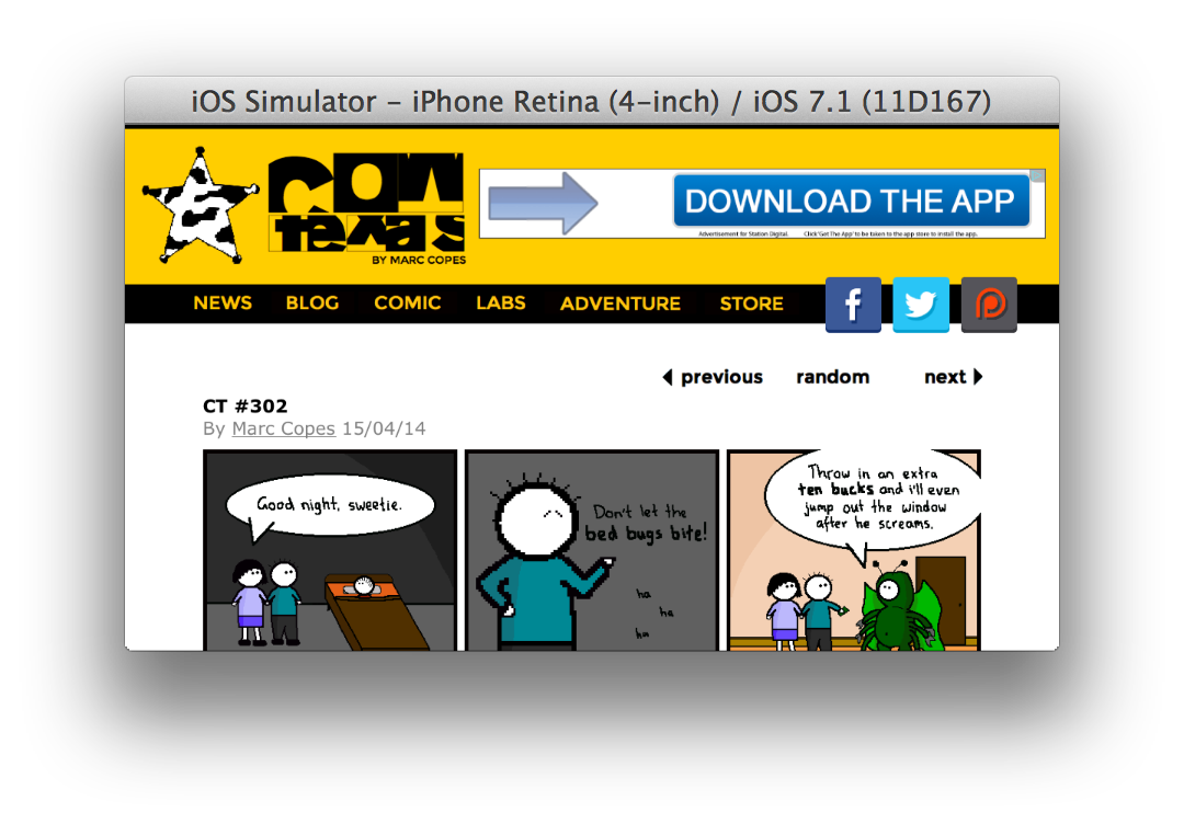
Add the following right under your opening <head> tag:
<meta name="viewport" content="width=1200">Basically what this does is tells mobile devices to zoom out so the full width of 1200 pixels is visible on the screen during initial load. Since your site is 1200 pixels wide, everything should show up, instead of having some of your social media icons cut off and the site not entirely centered, like before.
After adding the meta tag, it should look something like this:
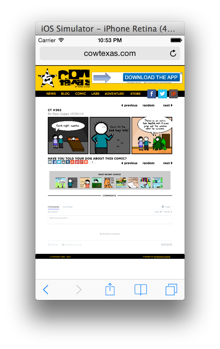
Portrait:
Landscape:
 Participant
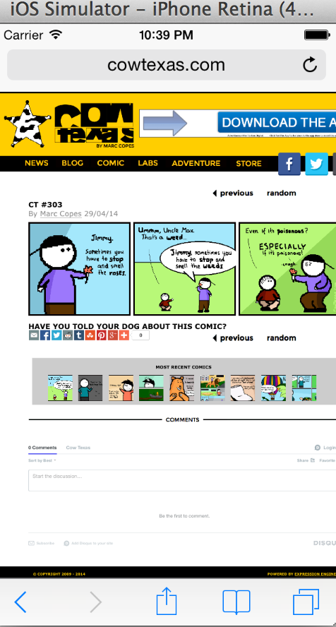
I noticed the horizontal scroll happening on the comic page in portrait view:
I’m attempting to try and see if I can figure out what’s causing it.
ParticipantHave you solved this issue? The Next, Previous, and other navigation buttons seem to work for me.
ParticipantI’m kind of interested to see if a clicking the comic to bring up a lightbox with pinch and zoom functionality would be a good experience. It would keep all your other content properly zoomed, but it might be not be intuitive enough for people to get it inherently. Something to consider.
In my experience, lightboxes rarely ever work well on a mobile browser. You’re much better off just taking someone to a new page (or at least make them feel like they’ve gone to a new page) rather than using a lightbox. Plus a lightbox like that would require javascript, both to handle that pinch/zoom functionality, as well as properly centering content on the screen depending on your mobile browser (since iPhones, Androids, Window phones, etc rarely have the same screen size). This could possibly cause an increased load time for a mobile phone not connected to wifi, versus a pure CSS, non lightbox solution that allows for scaling up to 2x for the whole screen. Part of what’s important for the mobile experience is not only that it looks good, but it’s fast.
That being said, I think an important factor in making responsive design work is you really should consider your mobile experience BEFORE you do a lot of coding for the desktop view of a site. Code up your site optimizing for the mobile experience first, then branch out creativity for the desktop and tablet views of the site. I have found that going the other way (desktop focus first with the mobile experience added as an afterthought) is what leads to a bad mobile experience and gives responsive design a bad reputation.
An interesting mobile experience, which only really works for comics that always have the same sized panels consistently (like the traditional 3 panel strip), is that you could switch out the comic image in the mobile browsers for one where panels stack vertically. Similar to what you see happen to some strips in the Sunday comics in newspapers, when there was limited room to fit a comic horizontally on the page, but plenty of vertical space – this technique could easily be applied to a mobile comic experience where there is limited horizontal bandwidth available and still keep the comic readable without zooming. Anyway, food for thought.
ParticipantI love Bootstrap. Making a proper responsive WP theme that plays nicely with Comic Easel is something on my big list of things I want to do.
It’s a bit of a work in progress, but I do have a child theme I started that was a responsive Comic Easel child theme based off of bootstrap several months ago that could be a starting point for some people. A demo can be found here
Since then though, I’ve been working on a completely different responsive theme for Tavern Wenches (although I’m still working on it a bit) that went with a Mobile First coding practices in both CSS and Javascript, to minimize load time as much as possible on mobile browsers. I decided to go completely custom with my theme mostly based on my mobile/tablet/desktop needs.
-
This reply was modified 10 years, 1 month ago by
-
This reply was modified 10 years, 1 month ago by
-
This reply was modified 9 years, 6 months ago by
-
AuthorPosts